
The bottom sheet has become a very popular place for quick interactions that do not require a full screen to do. Signing up for a news letter, splitting a bill, making a payment, sharing something, a search box that leads to a new page of results. It shows signs that the creator(s) of the app put thought into how and when certain features will be used. In this guide I’ll go over the basics of the bottomSheet, things to look out for and how to make use of it for something like this.
Showing a normal bottomSheet or a modalBottomSheet is interchangeable. The only thing to note is that the modal bottom sheet will show over the UI elements including the floating action button. So use as you see fit. We’ll be using the showBottomSheet function in this tutorial.
Showing the Bottom Sheet
The bottom sheet in Flutter is shown using the call showBottomSheet. Looking inside of that call we see the following line.
Scaffold.of(context).showBottomSheet<T>(builder)This means that you’ll have to be “under” a scaffold widget to be able to show it. If for instance you only have a MaterialApp with a single Scaffold and you want to show the bottomSheet it will fail with a long message but the gist of it being this.
Scaffold.of() called with a context that does not contain a ScaffoldThere are four ways around this. We’ll go over the three that don’t work and then the preferred one. Just head over to #4 if you don’t care about the other solutions.
-
You wrap your Home widget of the Material App in a Scaffold. This will work for the body of the first Scaffold but in the view navigated to you will face the same problem. - Not maintainable and also a hacky solution ❌
-
Return your body from a
Builder. This is a common way in Flutter to place a widget “under” the current widget and give it a context that has the current widget as a child. Take a look at this. - 🆗 but not preferred.
class MyApp extends StatelessWidget {
  // This widget is the root of your application.
  @override
  Widget build(BuildContext context) {
    return MaterialApp(
      title: 'Bottom Sheet guide',
      home: HomeView(),
    );
  }
}

class HomeView extends StatelessWidget {
  @override
  Widget build(BuildContext context) {
    return Scaffold( body: Builder(
      builder: (context) => Align(
            alignment: Alignment.bottomRight,
            child: FloatingActionButton(
              onPressed: () {
                showBottomSheet(
                    context: context,
                    builder: (context) => Container(
                          color: Colors.red,
                        ));
              },
            ),
          ),
    ));
  }
}
In the above code we wrap our body for the Scaffold (Current widget) in a builder so we put it “under” the current widget in the tree. The widget built by the builder goes below the current so when Scaffold.of() is called we get to the Scaffold from the current widget above of. Cool note: If you place the Builder at the level of the Scaffold, for instance returning a builder that returns a FloatingActionButton then the floating action button will lift up with the dialog
- A less elegant way is to Provide the Scaffold with a global key, access the state and use the showBottomSheet function directly. - ❌ Try and stay away from this if you can. Multiple GlobalKey’s have an impact on performance and you’ll need one for every Scaffold you navigate to so it’s not an option. We’ll show this way just in case you might need it for some reason.
class HomeView extends StatelessWidget {
  final GlobalKey<ScaffoldState> scaffoldKey = GlobalKey<ScaffoldState>();

  @override
  Widget build(BuildContext context) {
    return Scaffold(
      key: scaffoldKey,
      floatingActionButton: FloatingActionButton(
        onPressed: () {
          scaffoldKey.currentState
          .showBottomSheet((context) => Container(
                color: Colors.red,
              ));
        },
      ),
      body: Center(
        child: Text('HomeView'),
      ),
    );
  }
}
This code will now work even if there’s no Scaffold “above” the widget. This is because we’re not doing the Scaffold.of() call. Instead we’re accessing the ScaffoldState directly.
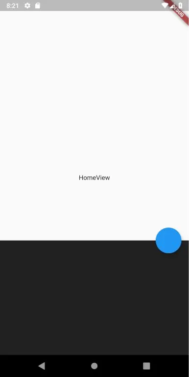
- Show the Bottom Sheet from within a widget - ✔️ - This is the best way to do it. Composing your widget tree out of multiple layers of widgets that combine certain pieces of UI should be your default method of implementation. This way all our widgets requiring context from either the Navigator or the Scaffold will always have access to it and you can make your rebuilds more efficient this way.
class HomeView extends StatelessWidget {
  @override
  Widget build(BuildContext context) {
    return Scaffold(
      floatingActionButton: MyFloatingActionButton(),
      body: Center(
        child: Text('HomeView'),
      ),
    );
  }
}

class MyFloatingActionButton extends StatelessWidget {
  @override
  Widget build(BuildContext context) {
    return FloatingActionButton(
      onPressed: () {
        showBottomSheet(
            context: context,
            builder: (context) => Container(
                  color: Colors.red,
                ));
      },
    );
  }
}
The code above will work and is also the clearest and easiest to maintain solution. The context within the MyFloatingActionButton widget is now “under” the scaffold so the Scaffold.of() call will find one above it to use.
Bottom Sheet sizing
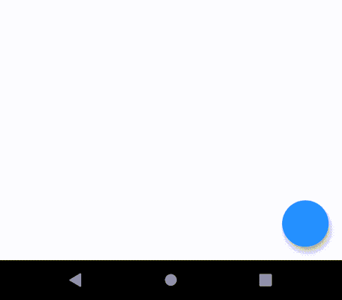
By Default showBottomSheet will wrap the height of the widget that is built. Therefor it’s always a good idea to give it a fixed height. You can do this by making the root child of the builder a Container since you’ll also want to give it a background color to block out whatever is underneath it. Using showModalBottomSheet will not stretch full screen and will have a fixed size if your child has no bounds.
showBottomSheet(
    context: context,
    builder: (context) => Container(
          color: Colors.grey[900],
          height: 250,
        ));
The code above will show this.
From this point onward you have free reign of the normal widget styling and UI building. You can dynamically calculate your height based on the children you’ll pass in to it using some basic addition math.
Knowing when it closes
The showBottomSheet function returns a PersistentBottomSheetController which is a generic class. We can use this to subscribe to when the sheet closes. In our case we want to hide the Floating action button when the sheet opens and show it again when it’s closed. Lets make our MyFloatingActionButton stateful and update our state class to this.
class _MyFloatingActionButtonState extends State<MyFloatingActionButton> {
  bool showFab = true;

  @override
  Widget build(BuildContext context) {
    return showFab
        ? FloatingActionButton(
            onPressed: () {
               var bottomSheetController = showBottomSheet(
                  context: context,
                  builder: (context) => Container(
                        color: Colors.grey[900],
                        height: 250,
                      ));

              showFoatingActionButton(false);

              bottomSheetController.closed.then((value) {
                showFoatingActionButton(true);
              });
            },
          )
        : Container();
  }

  void showFoatingActionButton(bool value) {
    setState(() {
      showFab = value;
    });
  }
}
We keep a local state variable that indicates if the FAB is visible or not called showFab. When the button is pressed we showBottomSheet and keep a local reference to the controller that’s attached to it and we hide the floating action button. We then subscribe to the closed future and when complete we showFloatingActionButton again. You now should see something like this.
Basic Bottom sheet UI
Lets build something with this that is a common UI interface in the higher end applications. A bottom sheet that takes in information, rebuild the modal sheet state (show a busy indicator while running an async operation). Show a success icon and close the sheet automatically when an operation is completed. We’ll make something like this.
We’ll start by creating a stateful widget for the BottomSheetWidget. Our main widget container we’ll set to 160 in height and give some margins. Additionally for the root column we’ll center the children.
class BottomSheetWidget extends StatefulWidget {
  @override
  _BottomSheetWidgetState createState() => _BottomSheetWidgetState();
}

class _BottomSheetWidgetState extends State<BottomSheetWidget> {
  @override
  Widget build(BuildContext context) {
    return Container(
      margin: const EdgeInsets.only(top: 5, left: 15, right: 15),
      height: 160,
      child: Column(
        mainAxisSize: MainAxisSize.max,
        mainAxisAlignment: MainAxisAlignment.center,
        children: []
      ),
    );
  }
}
All the code following will be in the children property of the Column above. I’ll out the code above to keep the snippets easy to consume. We’ll start by creating our floating white container that will contain our input field and button.
 Container(
    height: 125,
    decoration: BoxDecoration(
        color: Colors.white,
        borderRadius: BorderRadius.all(Radius.circular(15)),
        boxShadow: [
          BoxShadow(
              blurRadius: 10, color: Colors.grey[300], spreadRadius: 5)
        ]),
    child: Column(
      children: []
    ),
 )
Then we can add a DecoratedTextField widget for our Input field. A container with rounded corners and a background color with a TextField in the center that has no outline borders.
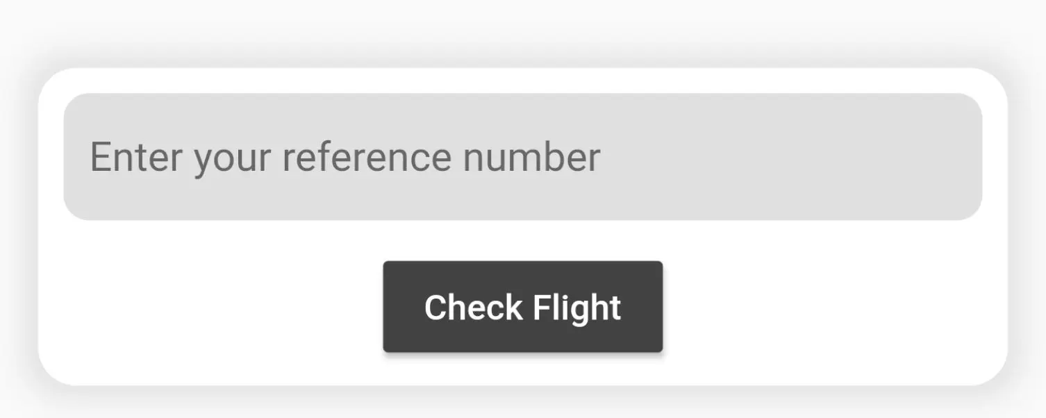
class DecoratedTextField extends StatelessWidget {
  @override
  Widget build(BuildContext context) {
    return Container(
        height: 50,
        alignment: Alignment.center,
        padding: const EdgeInsets.symmetric(horizontal: 10, vertical: 10),
        margin: const EdgeInsets.symmetric(horizontal: 10, vertical: 10),
        decoration: BoxDecoration(
            color: Colors.grey[300], borderRadius: BorderRadius.circular(10)),
        child: TextField(
          decoration: InputDecoration.collapsed(
            hintText: 'Enter your reference number',
          ),
        ));
  }
}
As well as the stateful button for the sheet called SheetButton. We’ll keep two local variables, one to indicate we’re busy “checking the input” and the other to indicate success. The build will return the button if it’s not busy and will return either a progress indicator or an Icon depending on what the state of success is while it’s busy.
class SheetButton extends StatefulWidget {
  _SheetButtonState createState() => _SheetButtonState();
}

class _SheetButtonState extends State<SheetButton> {
  bool checkingFlight = false;
  bool success = false;

  @override
  Widget build(BuildContext context) {
    return !checkingFlight
        ? MaterialButton(
            color: Colors.grey[800],
            onPressed: () {
            },
            child: Text(
              'Check Flight',
              style: TextStyle(color: Colors.white),
            ),
          )
        : !success
            ? CircularProgressIndicator()
            : Icon(
                Icons.check,
                color: Colors.green,
              );
  }
}
To add the stateful logic what we want to do when the button is pressed is.
- Set the state of checkingFlight = true (to show busy indicator)
- After 1 second we want to set success to true (to show icon)
- Wait half a second then remove the dialog
We’ll do all of this in the onPressed function above.
 MaterialButton(
  onPressed: () async {
    setState(() {
      checkingFlight = true;
    });

    await Future.delayed(Duration(seconds: 1));

    setState(() {
      success = true;
    });

    await Future.delayed(Duration(milliseconds: 500));

    Navigator.pop(context);
  }
 )
Now we can use the DecoratedTextField and SheetButton in the _BottomSheetWidgetState build function.
 Widget build(BuildContext context) {
    return Container(
      ...
      child: Column(
        ...
        children: <Widget>[
          Container(
            ...
            child: Column(
              children: <Widget>[
                DecoratedTextField(),
                SheetButton(),
              ],
            ),
          )
        ],
      ),
    );
  }
I hope that gives you a better idea of the capabilities of the basic bottom sheet functionality. It has more advanced features like providing animation controllers and using gestures to open the sheet but to keep this tutorial short we’re only covering what you need to start building a seemless user experience. Check out the other tutorials on the website for more Flutter goodness.