
One of the core principles of clean code is DRY. Don’t Repeat Yourself! This applies to ALL CODE written. Watch the rest of this video and over the next 10 minutes you’ll see how you can setup your app’s design system to reduce the amount of repeated code when building your applications UI. This makes it easier to achieve a consistent design look throughout your application as you expand.
Welcome back to Episode 10 of the Building a Food Delivery service series. This episode, like all others can be watched on it’s own. But, if you want to see how we built the code to where it is then make sure to watch the series from the beginning. Playlist can be found in the top right corner.
Setup
Today we’ll be building our design system ui in a separate package. This is not required. The reason we’re doing this is because we’ll use the same design system in the the other 3 apps for this product. This will make it easy for us to share all those widgets and styles later on.
Package Setup
We’ll start off by creating a new package called box_ui
flutter create --template=package box_uiWhen that’s complete we want to create the example app for the package. Navigate into the box_ui folder and create the example app.
cd box_ui
flutter create example
Open up the example project and then we’ll add a relative path to the box_ui package.
box_ui:
  path: ../
Development Environment
Now that the package is setup, lets go over the development environment we’ll use during the development of the package. #1 we’ll always open up the box_ui folder in VS Code. In the root folder create a new folder .vscode Inside that folder create a new file called launch.json
{
  "version": "0.2.0",
  "configurations": [
    {
      "name": "Box UI Showcase",
      "cwd": "example",
      "request": "launch",
      "type": "dart"
    }
  ]
}
Now when you press F5 during development of the boxout project the example app will run where you can confirm your changes are working. Make sure to go to both flutter projects and update the min sdk in the pubspec.yaml to 2.12
Design System
So what is a design system? It’s a style guide that helps you build consistent UI as you grow your app and add new functionality. You get detailed and simple design systems, in both of them there’s a few things that has to be defined in order to qualify as a design system (for us when we request designs from a designer).
- Text Styling used in the design - Font Family, font weights for title, title 2, title 3, heading, body, etc.
- Buttons - All button types to be used in the app
- Input Fields - Showing all states, with leading (if any) focuses (if any) disabled, etc.
Once we have this we can build the UI first. For BoxtOut we have the following Design System
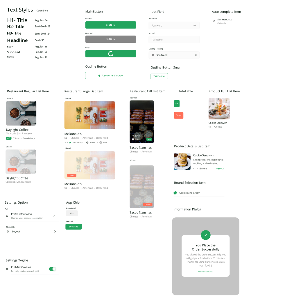
In this tutorial I will go through building some parts of this that we need for the UI that we currently have and want to build next. The only things we’ll cover is:
- Text Styles
- Main Button
- Outline Button
- Input Field
This is enough to align our current code with the designs. Let’s get started.
Code
In the box_ui lib folder we’ll create a new folder called src. This will contain all the package code that we don’t want to be visible outside of the package unless we expose it.
Text
We’ll start by creating some shared styles based on the text styles defined in the design system. We’ll create a file in lib/src/shared/styles.dart
import 'package:flutter/cupertino.dart';

// Text Styles

// To make it clear which weight we are using, we'll define the weight even for regular
// fonts
const TextStyle heading1Style = TextStyle(
  fontSize: 34,
  fontWeight: FontWeight.w400,
);

const TextStyle heading2Style = TextStyle(
  fontSize: 28,
  fontWeight: FontWeight.w600,
);

const TextStyle heading3Style = TextStyle(
  fontSize: 24,
  fontWeight: FontWeight.w600,
);

const TextStyle headlineStyle = TextStyle(
  fontSize: 30,
  fontWeight: FontWeight.w700,
);

const TextStyle bodyStyle = TextStyle(
  fontSize: 16,
  fontWeight: FontWeight.w400,
);

const TextStyle subheadingStyle = TextStyle(
  fontSize: 20,
  fontWeight: FontWeight.w400,
);

const TextStyle captionStyle = TextStyle(
  fontSize: 12,
  fontWeight: FontWeight.w400,
);
Here we define our text styles to be used in the app. Next up we create the BoxText file in lib/src/widgets/box_text.dart
import 'package:box_ui/src/shared/app_colors.dart';
import 'package:box_ui/src/shared/styles.dart';
import 'package:flutter/material.dart';

class BoxText extends StatelessWidget {
  final String text;
  final TextStyle style;

  const BoxText.headingOne(this.text) : style = heading1Style;
  const BoxText.headingTwo(this.text) : style = heading2Style;
  const BoxText.headingThree(this.text) : style = heading3Style;
  const BoxText.headline(this.text) : style = headlineStyle;
  const BoxText.subheading(this.text) : style = subheadingStyle;
  const BoxText.caption(this.text) : style = captionStyle;

  BoxText.body(this.text, {Color color = kcMediumGreyColor})
      : style = bodyStyle.copyWith(color: color);

  @override
  Widget build(BuildContext context) {
    return Text(
      text,
      style: style,
    );
  }
}
Pretty basic widget. We define the stateless widget with two final properties, text and style. We then define the named constructors for each of the styles we want and take in only the text. This will allow us to use a specific text style by simply doing BoxText.headline('My headline'). The next thing to add is to create is the shared colors in lib/src/shared/app_colors.dart
import 'package:flutter/material.dart';

const Color kcPrimaryColor = Color(0xff22A45D);
const Color kcMediumGreyColor = Color(0xff868686);
const Color kcLightGreyColor = Color(0xffe5e5e5);
const Color kcVeryLightGreyColor = Color(0xfff2f2f2);
Make sure to import the above into your BoxText file when created.
Button
We can create a new file in the widgets folder lib/src/widgets/box_button.dart
import 'package:box_ui/src/shared/app_colors.dart';
import 'package:box_ui/src/shared/styles.dart';
import 'package:flutter/material.dart';

class BoxButton extends StatelessWidget {
  final String title;
  final bool disabled;
  final bool busy;
  final void Function()? onTap;
  final bool outline;
  final Widget? leading;

  const BoxButton({
    Key? key,
    required this.title,
    this.disabled = false,
    this.busy = false,
    this.onTap,
    this.leading,
  })  : outline = false,
        super(key: key);

  const BoxButton.outline({
    required this.title,
    this.onTap,
    this.leading,
  })  : disabled = false,
        busy = false,
        outline = true;

  @override
  Widget build(BuildContext context) {
    return GestureDetector(
      onTap: onTap,
      child: AnimatedContainer(
        duration: const Duration(milliseconds: 350),
        width: double.infinity,
        height: 48,
        alignment: Alignment.center,
        decoration: !outline
            ? BoxDecoration(
                color: !disabled ? kcPrimaryColor : kcMediumGreyColor,
                borderRadius: BorderRadius.circular(8),
              )
            : BoxDecoration(
                color: Colors.transparent,
                borderRadius: BorderRadius.circular(8),
                border: Border.all(
                  color: kcPrimaryColor,
                  width: 1,
                )),
        child: !busy
            ? Row(
                mainAxisSize: MainAxisSize.min,
                children: [
                  if (leading != null) leading!,
                  if (leading != null) SizedBox(width: 5),
                  Text(
                    title,
                    style: bodyStyle.copyWith(
                      fontWeight: !outline ? FontWeight.bold : FontWeight.w400,
                      color: !outline ? Colors.white : kcPrimaryColor,
                    ),
                  ),
                ],
              )
            : CircularProgressIndicator(
                strokeWidth: 8,
                valueColor: AlwaysStoppedAnimation(Colors.white),
              ),
      ),
    );
  }
}
This is a basic container with 1 of 2 decorations active. One is a filled decoration with primary color as the background and the other is an outline decoration with primary color as the outline and children colors.
Input Field
Last in line is to create the input field for the design system. Create a new file src/lib/widgets/input_field.dart
import 'package:box_ui/src/shared/app_colors.dart';
import 'package:flutter/material.dart';

class BoxInputField extends StatelessWidget {
  final TextEditingController controller;
  final String placeholder;
  final Widget? leading;
  final Widget? trailing;
  final bool password;
  final void Function()? trailingTapped;

  final circularBorder = OutlineInputBorder(
    borderRadius: BorderRadius.circular(8),
  );

  BoxInputField({
    Key? key,
    required this.controller,
    this.placeholder = '',
    this.leading,
    this.trailing,
    this.trailingTapped,
    this.password = false,
  }) : super(key: key);

  @override
  Widget build(BuildContext context) {
    return TextField(
      controller: controller,
      style: TextStyle(height: 1),
      obscureText: password,
      decoration: InputDecoration(
        hintText: placeholder,
        contentPadding:
            const EdgeInsets.symmetric(vertical: 15, horizontal: 20),
        filled: true,
        fillColor: kcVeryLightGreyColor,
        prefixIcon: leading,
        suffixIcon: trailing != null
            ? GestureDetector(
                onTap: trailingTapped,
                child: trailing,
              )
            : null,
        border: circularBorder.copyWith(
          borderSide: BorderSide(color: kcLightGreyColor),
        ),
        errorBorder: circularBorder.copyWith(
          borderSide: BorderSide(color: Colors.red),
        ),
        focusedBorder: circularBorder.copyWith(
          borderSide: BorderSide(color: kcPrimaryColor),
        ),
        enabledBorder: circularBorder.copyWith(
          borderSide: BorderSide(color: kcLightGreyColor),
        ),
      ),
    );
  }
}
There’s nothing special here so I won’t go through it all in detail. The only thing worth mentioning is the GestureDetector on the trailing icon. Which we’ll use for the clear text in search.
Expose Library Classes
Last thing is to expose the things we want to expose from the box_ui package.
library box_ui;

// Widgets Export
export 'src/widgets/box_text.dart';
export 'src/widgets/box_button.dart';
export 'src/widgets/box_input_field.dart';

// Colors Export
export 'src/shared/app_colors.dart';
And that’s it for building the basics for the design system that we’ll need.
Example
to make use of this we’ll simply construct all of these widgets in a widget and set it as the HomeView in the example app. Create a new file in example/lib/example_view.dart
import 'package:box_ui/box_ui.dart';
import 'package:flutter/material.dart';
class ExampleView extends StatelessWidget {
const ExampleView({Key? key}) : super(key: key);
@override
Widget build(BuildContext context) {
return Scaffold(
body: ListView(
padding: const EdgeInsets.symmetric(horizontal: 25, vertical: 30),
children: [
BoxText.headingOne('Design System'),
verticalSpaceSmall,
Divider(),
verticalSpaceSmall,
...buttonWidgets,
...textWidgets,
...inputFields,
],
),
);
}
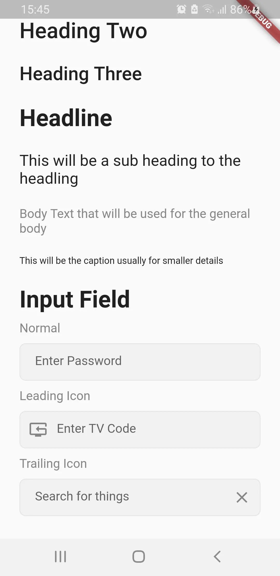
List<Widget> get textWidgets => [
BoxText.headline('Text Styles'),
verticalSpaceMedium,
BoxText.headingOne('Heading One'),
verticalSpaceMedium,
BoxText.headingTwo('Heading Two'),
verticalSpaceMedium,
BoxText.headingThree('Heading Three'),
verticalSpaceMedium,
BoxText.headline('Headline'),
verticalSpaceMedium,
BoxText.subheading('This will be a sub heading to the headling'),
verticalSpaceMedium,
BoxText.body('Body Text that will be used for the general body'),
verticalSpaceMedium,
BoxText.caption('This will be the caption usually for smaller details'),
verticalSpaceMedium,
];
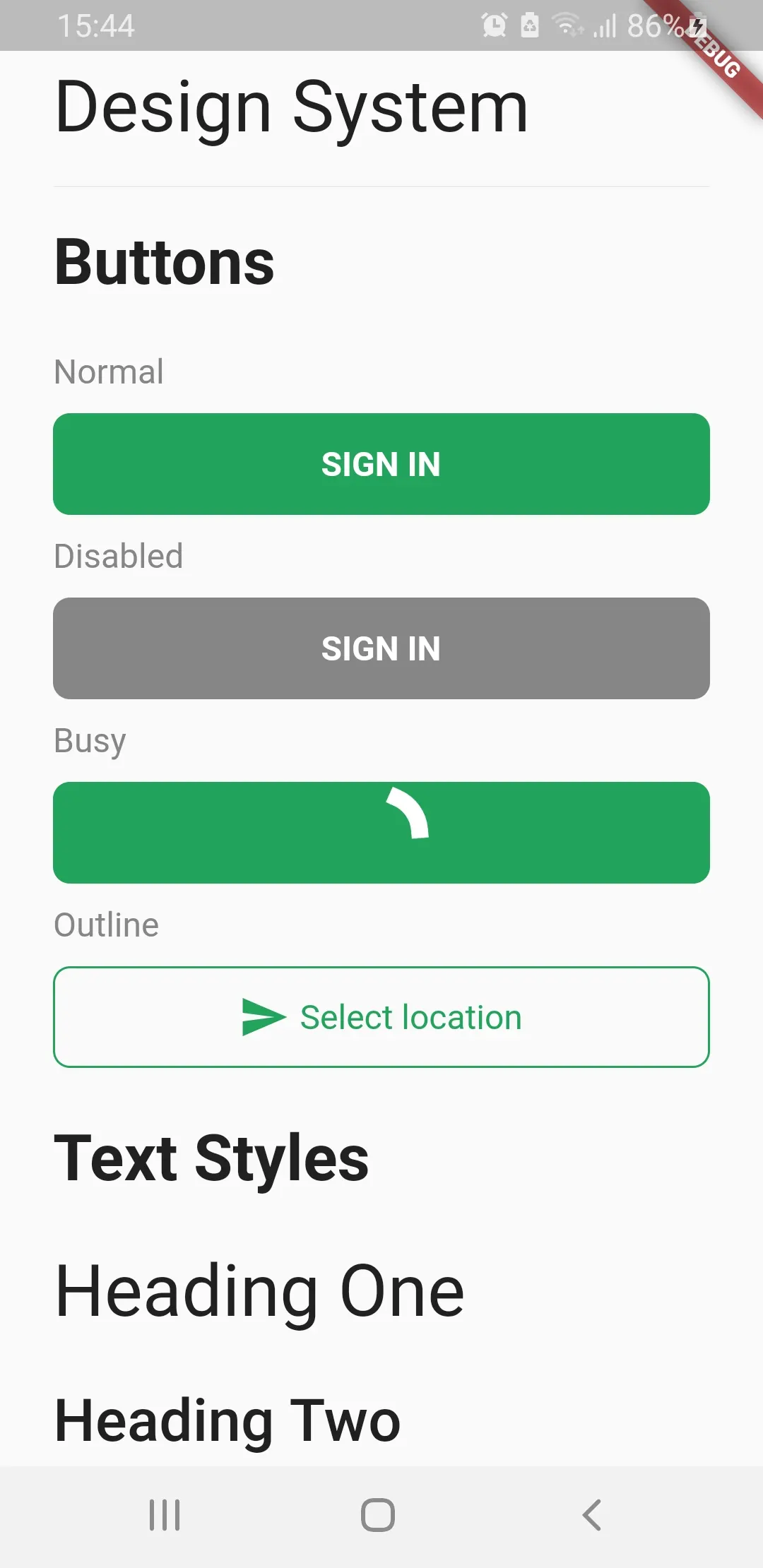
List<Widget> get buttonWidgets => [
BoxText.headline('Buttons'),
verticalSpaceMedium,
BoxText.body('Normal'),
verticalSpaceSmall,
BoxButton(
title: 'SIGN IN',
),
verticalSpaceSmall,
BoxText.body('Disabled'),
verticalSpaceSmall,
BoxButton(
title: 'SIGN IN',
disabled: true,
),
verticalSpaceSmall,
BoxText.body('Busy'),
verticalSpaceSmall,
BoxButton(
title: 'SIGN IN',
busy: true,
),
verticalSpaceSmall,
BoxText.body('Outline'),
verticalSpaceSmall,
BoxButton.outline(
title: 'Select location',
leading: Icon(
Icons.send,
color: kcPrimaryColor,
),
),
verticalSpaceMedium,
];
List<Widget> get inputFields => [
BoxText.headline('Input Field'),
verticalSpaceSmall,
BoxText.body('Normal'),
verticalSpaceSmall,
BoxInputField(
controller: TextEditingController(),
placeholder: 'Enter Password',
),
verticalSpaceSmall,
BoxText.body('Leading Icon'),
verticalSpaceSmall,
BoxInputField(
controller: TextEditingController(),
leading: Icon(Icons.reset_tv),
placeholder: 'Enter TV Code',
),
verticalSpaceSmall,
BoxText.body('Trailing Icon'),
verticalSpaceSmall,
BoxInputField(
controller: TextEditingController(),
trailing: Icon(Icons.clear_outlined),
placeholder: 'Search for things',
),
];
}And update the main.dart file to make use of this file.
import 'package:box_ui/box_ui.dart';
import 'package:flutter/material.dart';

import 'example_view.dart';

void main() {
  runApp(MyApp());
}

class MyApp extends StatelessWidget {
  // This widget is the root of your application.
  @override
  Widget build(BuildContext context) {
    return MaterialApp(
      title: 'Flutter Demo',
      theme: ThemeData(
        primaryColor: kcPrimaryColor,
      ),
      home: ExampleView(),
    );
  }
}
If you run the example app now you should see something like below
These are the basic building blocks for everything. We will use this to build the rest of the UI as we implement the functionality.