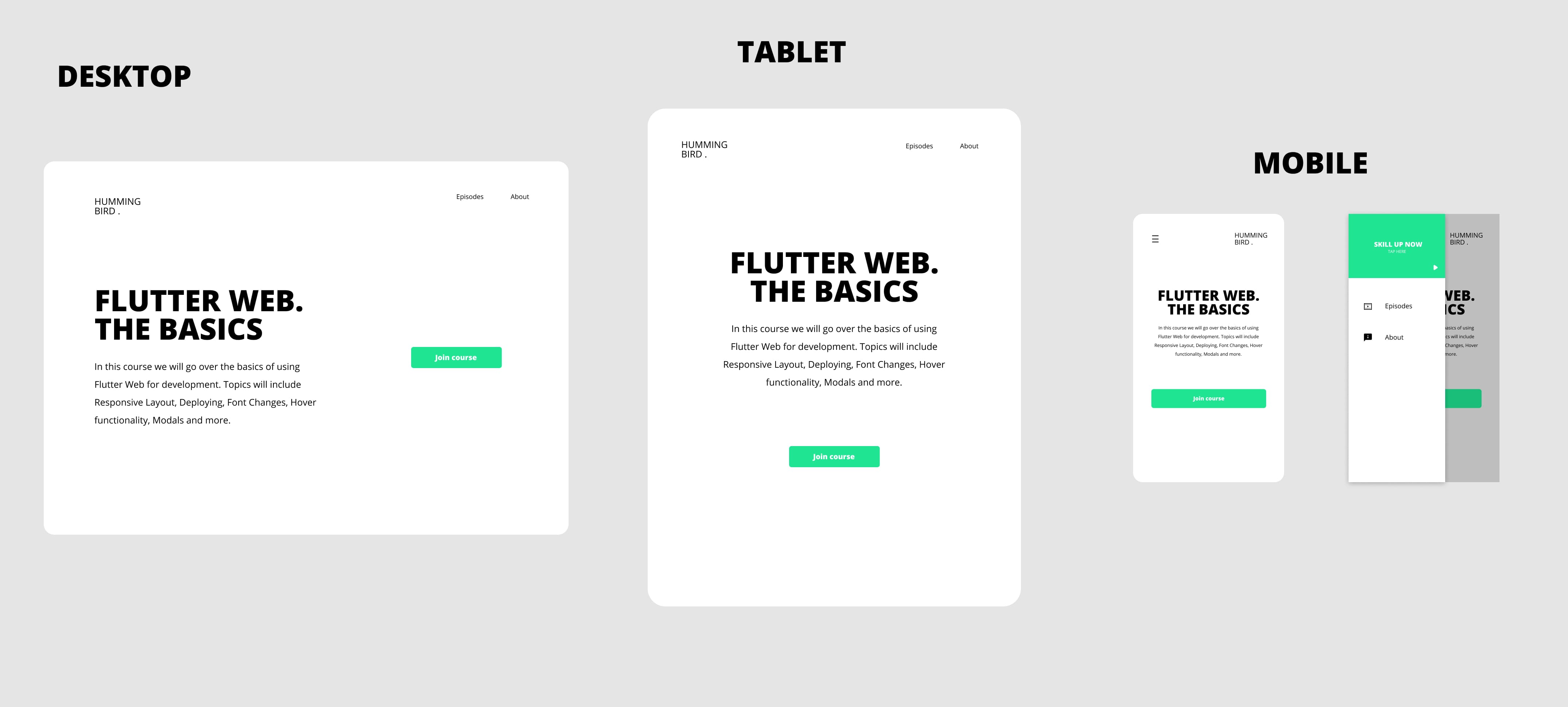
Today we’ll continue on the Flutter Web series by making the web UI we built responsive. Below you can see our goal. A different layout for each of the major screen sizes. Desktop, Tablet and Mobile.
If you didn’t follow along with Part 1 you can download the starting code here. We’ll start off by adding the new responsive builder package. This package is made to make the code for a responsive UI easier to read and maintain. Go to the pubspec and add the package.
responsive_builder: ^0.1.2UI Implementation
Lets start by tackling the mobile layouts for individual widgets it can apply to.
Navigation bar
If you look at the way the Navigation bar looks we can see that the icon moves to the right hand side and a hamburger icon appear in the top left. Firstly we’ll move the code for the logo into it’s own widget since we know it’s going to be used in multiple layouts. Create a new file under the navigation_bar folder called navbar_logo.dart and move the logo image code in there.
class NavBarLogo extends StatelessWidget {
  const NavBarLogo({Key key}) : super(key: key);

  @override
  Widget build(BuildContext context) {
    return SizedBox(
      height: 80,
      width: 150,
      child: Image.asset('assets/logo.png'),
    );
  }
}
We also have to move the _NavBarItem into it’s own widget. Create a new file called navbar_item.dart in the navigation_bar folder and move the _NavBarItem in there.
class NavBarItem extends StatelessWidget {
  final String title;
  const NavBarItem(this.title);

  @override
  Widget build(BuildContext context) {
    return Text(
      title,
      style: TextStyle(fontSize: 18),
    );
  }
}
Then we can go ahead and create the Tablet/Desktop layout for the website. It’s the exact same code that we have in the navigation_bar file now. Create a new file in the navigation_bar folder called navigation_bar_tablet_desktop.dart and paste the body of the build function from the navigation_bar file in there. Replace the Logo code with a NavBarLogo widget and remove the underscore (*) from the _NavBarItem.
class NavigationBarTabletDesktop extends StatelessWidget {
  const NavigationBarTabletDesktop({Key key}) : super(key: key);

  @override
  Widget build(BuildContext context) {
    return Container(
      height: 100,
      child: Row(
        mainAxisAlignment: MainAxisAlignment.spaceBetween,
        children: <Widget>[
          NavBarLogo(),
          Row(
            mainAxisSize: MainAxisSize.min,
            children: <Widget>[
              NavBarItem('Episodes'),
              SizedBox(
                width: 60,
              ),
              NavBarItem('About'),
            ],
          )
        ],
      ),
    );
  }
}
Now we can go ahead and setup a screen type layout in the navgation_bar main layout file. We’ll import the responsive_builder package then set the NavigationBarTabletDesktop to the tablet layout and set the mobile layout to a new widget called NavigationBarMobile.
import 'package:responsive_builder/responsive_builder.dart';

class NavigationBar extends StatelessWidget {
  const NavigationBar({Key key}) : super(key: key);

  @override
  Widget build(BuildContext context) {
    return ScreenTypeLayout(
      mobile: NavigationBarMobile(),
      tablet: NavigationBarTabletDesktop(),
    );
  }
}
Then we can go ahead and create the mobile layout. Under the navigation_bar folder create a new file called navigation_bar_mobile.dart. We’ll make the root a container with a height of 80. The child of the container will be a row that has the alignment set to spaceBetween and the size set to max so it fills the screen. The first child is the menu icon as a button and the second child is the NavBarLogo.
class NavigationBarMobile extends StatelessWidget {
  const NavigationBarMobile({Key key}) : super(key: key);

  @override
  Widget build(BuildContext context) {
    return Container(
      height: 80,
      child: Row(
        mainAxisSize: MainAxisSize.max,
        mainAxisAlignment: MainAxisAlignment.spaceBetween,
        children: <Widget>[
          IconButton(
            icon: Icon(Icons.menu),
            onPressed: () {},
          ),
          NavBarLogo()
        ],
      ),
    );
  }
}
If you run the code now you will see everything looks the same but when you shrink the width of your window down to mobile size you’ll see the navbar change to this.
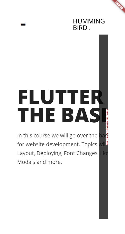
That’s it for the navigation bar for now. We still have to add a callback function to open the drawer when the icon is tapped but we’ll do that once we have a drawer in place.
Next up we’ll do the Home view itself.
Home
For the home view we also only have two layouts. One for mobile and tablet and one for desktop. The Mobile and tablet version stacks the CourseDescription in a column above the CallToAction button. For desktop we use a Row. But it’s not the entire HomeView that’s different. There’s a lot that will stay the same. Therefore we’ll only swap out the content in the expanded widget. We’ll start by moving the current content for the desktop into it’s own widget. Create a new file called home_content_desktop.dart
class HomeContentDesktop extends StatelessWidget {
  const HomeContentDesktop({Key key}) : super(key: key);

  @override
  Widget build(BuildContext context) {
    return Row(
      children: <Widget>[
        CourseDetails(),
        Expanded(
          child: Center(
            child: CallToAction('Join Course'),
          ),
        )
      ],
    );
  }
}
Next up we’ll create the Mobile layout which will be used for the tablet as well. We put everything in a Column, we set the alignment to centre, set the sizing to take up max space vertically and add a space of 100 between the details and the CTA.
import 'package:flutter/material.dart';
import 'package:the_basics/widgets/call_to_action/call_to_action.dart';
import 'package:the_basics/widgets/course_details/course_details.dart';

class HomeContentMobile extends StatelessWidget {
  const HomeContentMobile({Key key}) : super(key: key);

  @override
  Widget build(BuildContext context) {
    return Column(
      mainAxisSize: MainAxisSize.max,
      mainAxisAlignment: MainAxisAlignment.center,
      children: <Widget>[
        CourseDetails(),
        SizedBox(height: 100,),
        CallToAction('Join Course'),
      ],
    );
  }
}
Head over to the HomeView and update the Expanded child and set it to a ScreenTypeLayout and supply your two different layout that was just created.
class HomeView extends StatelessWidget {
  @override
  Widget build(BuildContext context) {
    return Scaffold(
      backgroundColor: Colors.white,
      body: CenteredView(
        child: Column(
          children: <Widget>[
            NavigationBar(),
            Expanded(
              child: ScreenTypeLayout(
                mobile: HomeContentMobile(),
                desktop: HomeContentDesktop(),
              ),
            )
          ],
        ),
      ),
    );
  }
}
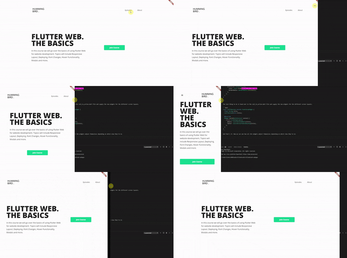
How awesome is that. Easy responsiveness, no conditionals everywhere to keep track of, no css break points to wonder about, nothing. Just pure readable dart code. Run the code and resize the browser, you’ll see that the UI changes as we get to the tablet size and again for the nav bar when we get to the mobile size. The last piece of responsive UI is for the CTA.
Call To Action
When it’s displaying on a mobile device I want it to stretch the entire view width. Create a new file under the call_to_action folder called call_to_action_tablet_desktop.dart. This is where the current call to action code will go. Cut the code from the build function in call_to_action.dart and paste it in there. Also pass the title through the constructor as a positional argument.
import 'package:flutter/material.dart';

class CallToActionTabletDesktop extends StatelessWidget {
  final String title;
  const CallToActionTabletDesktop(this.title);

  @override
  Widget build(BuildContext context) {
    return Container(
      padding: const EdgeInsets.symmetric(horizontal: 60, vertical: 15),
      child: Text(
        title,
        style: TextStyle(
          fontSize: 18,
          fontWeight: FontWeight.w800,
          color: Colors.white,
        ),
      ),
      decoration: BoxDecoration(
        color: Color.fromARGB(255, 31, 229, 146),
        borderRadius: BorderRadius.circular(5),
      ),
    );
  }
}
I’m not going to bother with setting up shared styles and decorations for containers now, instead we’ll just copy the code and duplicate it for now. We’ll handle “stylesheets” in one of the upcoming episodes. Create a new file under the call_to_action folder called call_to_action_mobile.dart.
class CallToActionMobile extends StatelessWidget {
  final String title;
  const CallToActionMobile(this.title);

  @override
  Widget build(BuildContext context) {
    return  Container(
      height: 60,
      alignment: Alignment.center,
      child: Text(
        title,
        style: TextStyle(
          fontSize: 18,
          fontWeight: FontWeight.w800,
          color: Colors.white,
        ),
      ),
      decoration: BoxDecoration(
        color: Color.fromARGB(255, 31, 229, 146),
        borderRadius: BorderRadius.circular(5),
      ),
    );
  }
}
The last thing to do is head over to the call_to_action.dart file and supply the new widgets for the different screen layouts.
class CallToAction extends StatelessWidget {
  final String title;
  CallToAction(this.title);

  @override
  Widget build(BuildContext context) {
    return ScreenTypeLayout(
      mobile: CallToActionMobile(title),
      tablet: CallToActionTabletDesktop(title),
    );
  }
}
And that’s it. Now we can see how all the widgets adjust themselves depending on which view they’re on.
Course Details
For the course details we’re dealing with text and it’s styling. What I want to achieve is make the text smaller for mobile only and have a center alignment for mobile and Tablet. To showcase the use of the base ResponsiveBuilder widget we’ll use that and have some conditional code. In the builder function we’ll calculate three values based on screen type. The first is the text alignment, when the screenType is Desktop we set it to left, otherwise we center the text. Second we want to set the titleSize to 50 if on mobile or to 80 on anything else. The last thing is the descriptionSize, we’ll set that to 16 on Mobile and 21 on any other screen.
Open up the CourseDetails widget and return a ResponsiveBuilder as the root of your build function. Then do the calculations and set the values where needed.
class CourseDetails extends StatelessWidget {
  @override
  Widget build(BuildContext context) {
    return ResponsiveBuilder(builder: (context, sizingInformation) {
      var textAlignment =
          sizingInformation.deviceScreenType == DeviceScreenType.Desktop
              ? TextAlign.left
              : TextAlign.center;

      double titleSize =
          sizingInformation.deviceScreenType == DeviceScreenType.Mobile
              ? 50
              : 80;
      double descriptionSize = sizingInformation.deviceScreenType == DeviceScreenType.Mobile ?
      16 : 21;
      return Container(
        width: 600,
        child: Column(
          crossAxisAlignment: CrossAxisAlignment.start,
          mainAxisAlignment: MainAxisAlignment.center,
          children: <Widget>[
            Text(
              'FLUTTER WEB.\nTHE BASICS',
              style: TextStyle(
                fontWeight: FontWeight.w800,
                height: 0.9,
                fontSize: titleSize,
              ),
              textAlign: textAlignment,
            ),
            SizedBox(
              height: 30,
            ),
            Text(
              'In this course we will go over the basics of using Flutter Web for website development. Topics will include Responsive Layout, Deploying, Font Changes, Hover Functionality, Modals and more.',
              style: TextStyle(
                fontSize: descriptionSize,
                height: 1.7,
              ),
              textAlign: textAlignment,
            )
          ],
        ),
      );
    });
  }
}
That’s it for the course details. Basically all the responsiveness is done for the layout. The only UI thing left to do is add a drawer for the mobile view and style that.
Navigation Drawer
The last piece of UI to build is the NavigationDrawer UI. This is how we’d like the UI to look.
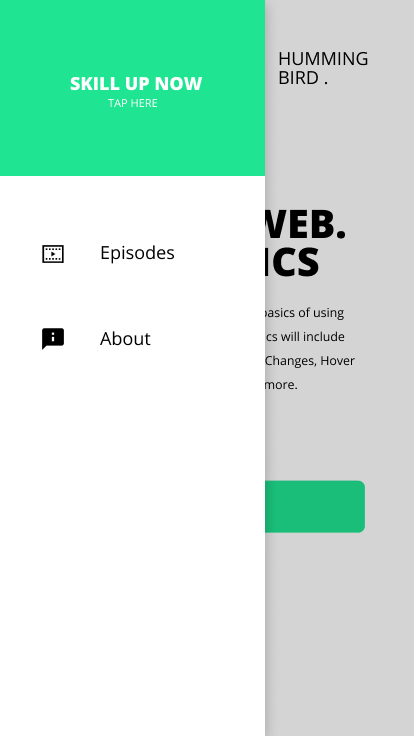
We have a header at the top with some text in it, then some DrawerItems. A logo and a NavBarItem next to it. To start off we’ll do a basic code refactor to get the primary color into one file. Create a new folder under lib called constants and inside create a new file called app_colors.dart.
import 'package:flutter/rendering.dart';

const Color primaryColor = Color.fromARGB(255, 31, 229, 146);
Replace the color in call_to_action_mobile with the primary color as well as the call_to_action_desktop. Then we can go ahead and start the NavigationDrawer code. Create a new folder called nav_drawer, we’ll place all the widgets for the drawer in here. Create a new file called drawer_item.dart. This will take in a title and icon data. The title will be displayed in a navbar item and the icon in a normal Icon widget, not a IconButton.
class DrawerItem extends StatelessWidget {
  final String title;
  final IconData icon;
  const DrawerItem(this.title, this.icon);

  @override
  Widget build(BuildContext context) {
    return Padding(
      padding: const EdgeInsets.only(left: 30, top: 60),
      child: Row(
        children: <Widget>[
          Icon(icon),
          SizedBox(width: 30),
          NavBarItem(title),
        ],
      ),
    );
  }
}
Next up we’ll make the NavigationDrawerHeader. Create a new file under the navigation_drawer folder called navigation_drawer_header.dart. The body will be a container with a height of 150. The color will be the primary color and we’ll set the alignment to center. The child will be a column that wraps content where the content is two Text widgets that are styled white.
class NavigationDrawerHeader extends StatelessWidget {
  const NavigationDrawerHeader({Key key}) : super(key: key);

  @override
  Widget build(BuildContext context) {
    return Container(
      height: 150,
      color: primaryColor,
      alignment: Alignment.center,
      child: Column(
        mainAxisSize: MainAxisSize.min,
        children: <Widget>[
          Text(
            'SKILL UP NOW',
            style: TextStyle(
              fontSize: 18,
              fontWeight: FontWeight.w800,
              color: Colors.white,
            ),
          ),
          Text(
            'TAP HERE',
            style: TextStyle(color: Colors.white),
          )
        ],
      ),
    );
  }
}
Then we can create a basic drawer body and use the widgets above in a column within the container body. Under the navigation_drawer folder create a new file called navigation_drawer.dart. Basic container, width 300 and a decoration to make the background white and provide the drop shadow. First child is the header, the second and third is DrawerItems, Episodes and About with icons the closest to the designs.
class NavigationDrawer extends StatelessWidget {
  const NavigationDrawer({Key key}) : super(key: key);

  @override
  Widget build(BuildContext context) {
    return Container(
      width: 300,
      decoration: BoxDecoration(
          color: Colors.white,
          boxShadow: [BoxShadow(color: Colors.black12, blurRadius: 16)]),
      child: Column(
        children: <Widget>[
          NavDrawerHeader(),
          DrawerItem('Episodes', Icons.videocam),
          DrawerItem('About', Icons.help),
        ],
      ),
    );
  }
}
To finish up the UI head over to the home_view.dart file and wrap the Scaffold in a ResponsiveBuilder. For the drawer we’ll check the sizingInformation for screenType mobile and supply the drawer. Otherwise we’ll supply null.
class HomeView extends StatelessWidget {
  @override
  Widget build(BuildContext context) {
    return ResponsiveBuilder(
      builder: (context, sizingInformation) => Scaffold(
        drawer: sizingInformation.deviceScreenType == DeviceScreenType.Mobile
            ? NavigationDrawer()
            : null,
        ...
      ),
    );
  }
}
And that’s it for this weeks tutorial. We won’t hook up any tap functionality like the nav drawer opening. We’ll dedicate a full episode and blog to handling the tap functionality in Flutter web. Subscribe to my YouTube channel to get the guide first and be notified when the new blog is up.


