
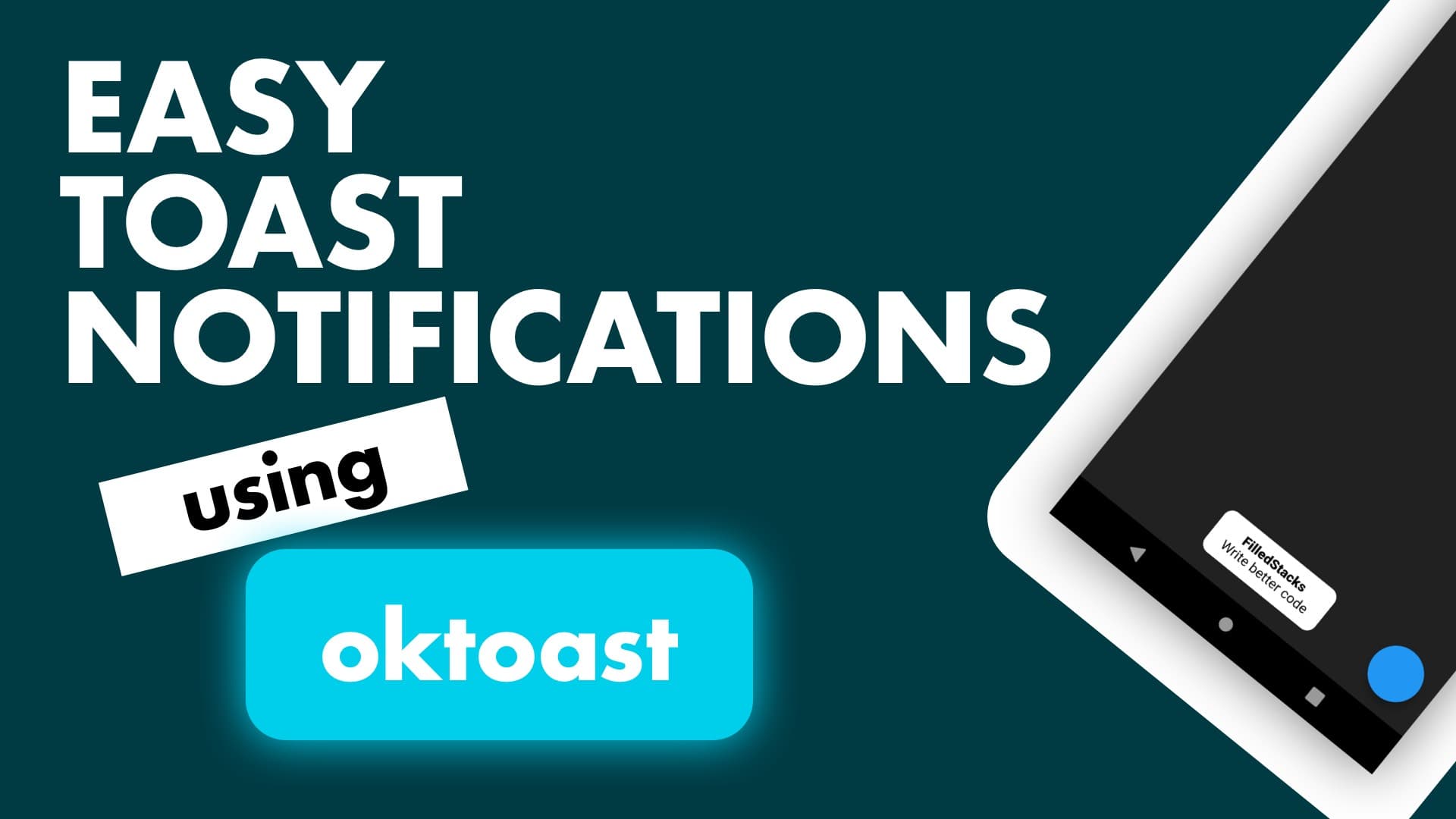
In this tutorial we’ll cover how to show toast messages in an easy was as well as style them to create some custom toasts. We’ll be using the oktoast package to achieve this.
Setup
Add the oktoast package to your pubspec
oktoast: ^2.1.8To get app wide functionality you wrap your MaterialApp with the OKToast widget.
import 'package:oktoast/oktoast.dart';

...

class MyApp extends StatelessWidget {
  @override
  Widget build(BuildContext context) {
    return OKToast(
      child: MaterialApp(
        home: Scaffold(
          backgroundColor: Colors.grey[900],
        ),
      ),
    );
  }
}
Basic Usage
Now we can add a floating action button to the scaffold and in the onPressed you can show a toast simply by calling
showToast('Hello FilledStacks', position: ToastPosition.bottom);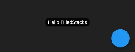
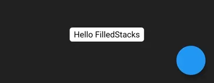
Styled Toast
In addition to the above call you can also add some styling ontop of the normal toast widget.
 showToast(
    'Hello FilledStacks',
    duration: Duration(seconds: 2),
    position: ToastPosition.bottom,
    backgroundColor: Colors.white,
    radius: 5.0,
    textStyle: TextStyle(fontSize: 16.0, color: Colors.black),
  );
Custom toast
If you don’t want the normal look your can create a complete custom “toast” but this functionality can be used for more than just toast messages. Important in app notifications styled how you like it, simple custom toasts. We’ll do something like below and we’ll show it at the bottom of the screen. Now the code for the widget will be elaborate because the showToastWidget stretches the root widget full screen.
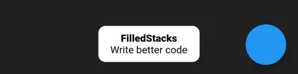
We’ll first create the widget that we want to show, keeping in mind the root stretches full screen we’ll start with padding (to keep it from the edges), then we’ll use an align to position our widget, we’ll use a ClipRRect to clip the container and we’ll use the Container to set the size. Create a new widget called toast_widget.dart
class ToastWidget extends StatelessWidget {
  final String title;
  final String description;
  const ToastWidget({this.title, this.description});

  @override
  Widget build(BuildContext context) {
    return Padding(
      padding: const EdgeInsets.all(20),
      child: Align(
        alignment: Alignment.bottomCenter,
        child: ClipRRect(
          borderRadius: BorderRadius.circular(10.0),
          child: Container(
            width: 140.0,
            height: 50.0,
            color: Colors.white,
            child: Column(
              mainAxisAlignment: MainAxisAlignment.center,
              children: <Widget>[
                Text(
                  title,
                  style: TextStyle(
                      color: Colors.black, fontWeight: FontWeight.w900),
                ),
                Text(
                  description,
                  style: TextStyle(color: Colors.black),
                )
              ],
            ),
          ),
        ),
      ),
    );
  }
}
We’ll pass in the title and description so we can change the messages when we need to. In your onPressed callback you can now call
   showToastWidget(
    ToastWidget(
      title: 'FilledStacks',
      description: 'Write Better Code',
    ),
    duration: Duration(seconds: 5));
This will show the widget shown above for 5 seconds. You can style this however you like giving you the freedom to utilise the toasts for some user feedback. If you liked this tutorial you might like the easy alerts tutorial as well.