
This tutorial is a follow up on Part 1 where we build a base widget that provides us with the appropriate information to build a responsive UI. Here you can find the starting code for this tutorial to which I have made a few adjustments compared to the part 1 video.
- Changed the name of the
BaseWidgettoResponsiveBuilder - Removed the
Orientationfrom theSizingInformation - Updated the
getDeviceTypefunction to use theshortestSizeproperty on the Size object instead of swapping width and height based on orientation.
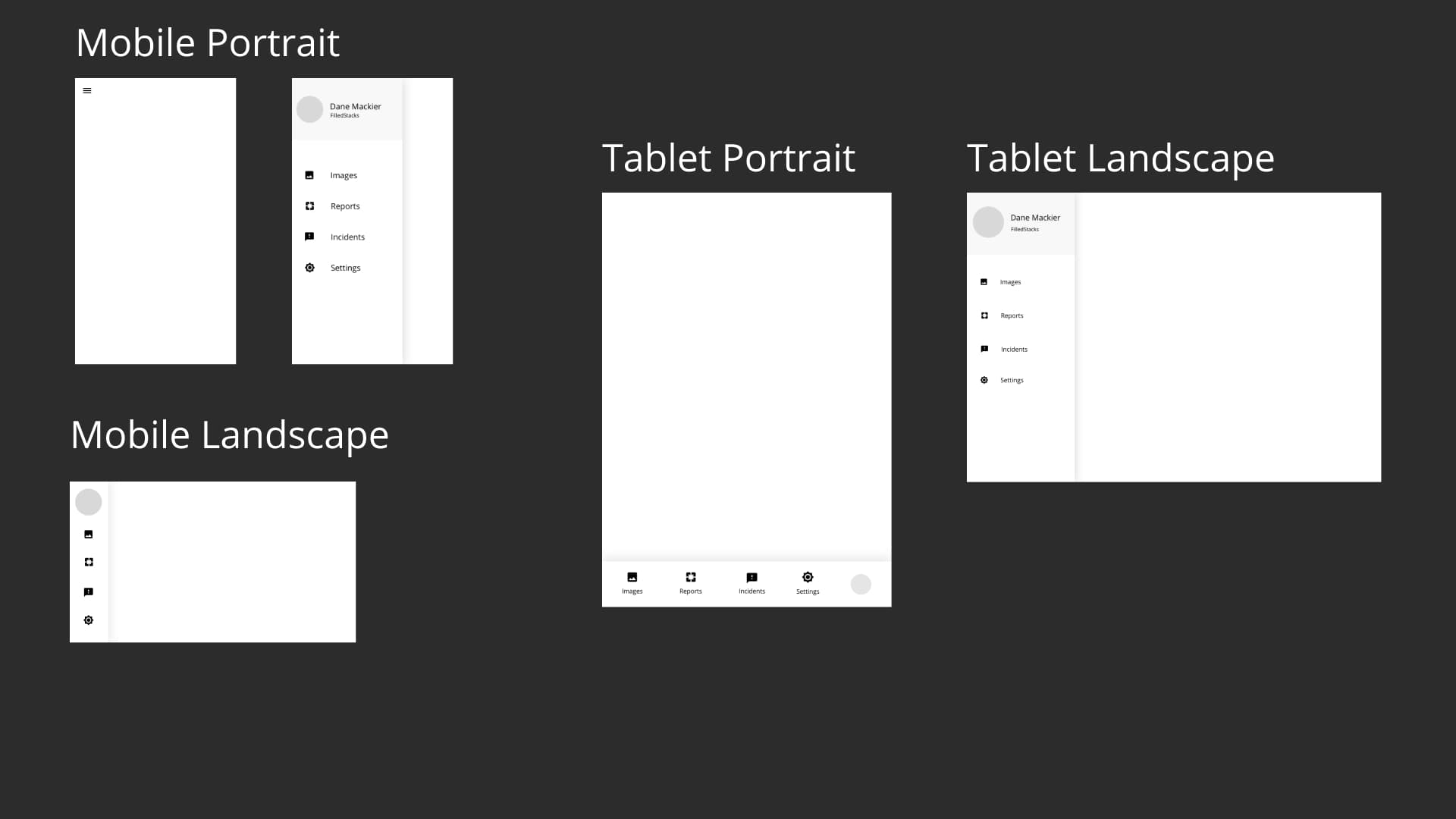
In this tutorial I wanted to show off the ability to build UI for any combination of ScreenType X Orientation. What that means is that I want to be able to define, per widget, its layout for MobileDevice in Portrait, MobileDevice in Landscape, TabletDevice in Portrait, TabletDevice in Landscape etc. I want to make it clear that I also don’t want to HAVE to define those layouts but I want to have the option. To illustrate this point I designed a simple layout where we’ll modify the drawer based on those axis defined above. Below you can see the layouts for each screen + orientation. I wanted the differences to be visible but also still make sense. We’re not going to discuss the UX, just the implementation of something like this.
In terms of the code organisation I have been going back and forth between the idea of storing multiple classes in one file. What I’ve ended up with is a file dedicated to the ScreenType the UI will display on. The file will contain both the Portrait and the Landscape layout if it has those. If you don’t understand 100% that’s fine, continue with the tutorial and you’ll see in a few minutes what I mean.
Building a Widget per Screen Type
To get started I want to define another base level widget that will make use of the ResponsiveBuilder to provide us with a handy widget. This widget is specifically made to make the code more readable making it easier to maintain in the long run. We’ll define a widget that will take in a widget for the mobile view as well as the tablet view. We’ll place it in the responsive folder in a file called screen_type_layout.dart.
class ScreenTypeLayout extends StatelessWidget {
  // Mobile will be returned by default
  final Widget mobile;
  final Widget tablet;
  final Widget desktop;

  const ScreenTypeLayout(
      {Key key, @required this.mobile, this.tablet, this.desktop})
      : super(key: key);

  @override
  Widget build(BuildContext context) {
    return ResponsiveBuilder(builder: (context, sizingInformation) {
      // If sizing indicates Tablet and we have a tablet widget then return
      if (sizingInformation.deviceScreenType == DeviceScreenType.Tablet) {
        if (tablet != null) {
          return tablet;
        }
      }

      // If sizing indicates desktop and we have a desktop widget then return
      if (sizingInformation.deviceScreenType == DeviceScreenType.Desktop) {
        if (desktop != null) {
          return desktop;
        }
      }

      // Return mobile layout if nothing else is supplied
      return mobile;
    });
  }
}
This widget will take in a Widget for each screen type. If one is not defined it will return the Mobile layout since we’re starting there. This will give us a nice an easily readable top level widget. Next
Building a Widget per Orientation
Next up we want to establish the second axis that we want to build our widgets for. This will be the orientation. Orientation is easily fetched through the MediaQuery but using that directly will force conditionals in every view that needs to build using it. I’m not a fan of code duplication. To achieve a neater approach we’ll create a new widget orientation_layout.dart. This will provide us with two properties where we can provide the portrait and landscape widgets that we’d like to show.
class OrientationLayout extends StatelessWidget {
  final Widget landscape;
  final Widget portrait;
  OrientationLayout({
    Key key,
    this.landscape,
    @required this.portrait,
  }) : super(key: key);

  @override
  Widget build(BuildContext context) {
    var orientation = MediaQuery.of(context).orientation;
    if (orientation == Orientation.landscape) {
      return landscape ?? portrait;
    }

    return portrait;
  }
}
The portrait widget is required and will be the default if no landscape widget is supplied. If I were to put this in a package I would make both required and add an assert that says “If you don’t supply both there’s not point in using this widget”. That’s it for the Architectural setup, now lets write the code for the first UI.
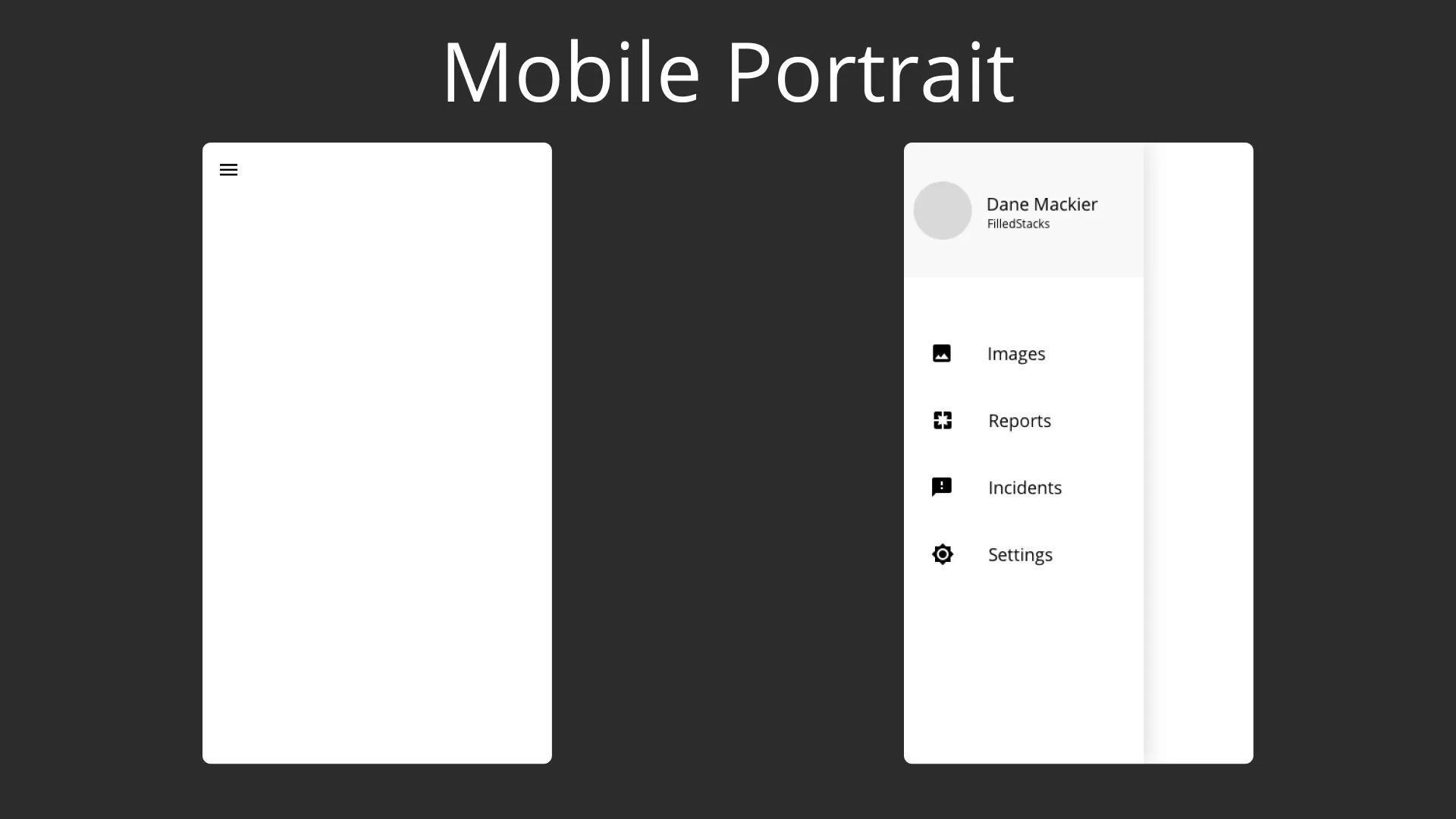
Mobile Screen - Portrait
Below you can see how we want the mobile view to look in portrait mode. We want a hamburger icon in the top left corner, when tapped we want to show our AppDrawer.
Lets use our new widgets to get that setup. We’ll start off by building our HomeView, we’ll use the ScreenTypeLayout. For the mobile widget we’ll use the OrientationLayout and define the portrait widget for starters. Head over to the HomeView and modify the build method to look like this.
class HomeView extends StatelessWidget {
  HomeView({Key key}) : super(key: key);

  @override
  Widget build(BuildContext context) {
    return ScreenTypeLayout(
      mobile: OrientationLayout(
        portrait: HomeMobilePortrait(),
      ),
    );
  }
}
Create a new file under home called home_view_mobile.dart and define the class HomeMobilePortrait which will display the mobile UI in portrait mode. Nothing special here, just a Scaffold with a key to open the scaffold from the icon press and an AppDrawer.
class HomeMobilePortrait extends StatelessWidget {
  final GlobalKey<ScaffoldState> _scaffoldKey = GlobalKey<ScaffoldState>();

  @override
  Widget build(BuildContext context) {
    return Scaffold(
      key: _scaffoldKey,
      drawer: AppDrawer(),
      body: Column(
        children: <Widget>[
          Padding(
            padding: const EdgeInsets.all(16.0),
            child: IconButton(
              icon: Icon(
                Icons.menu,
                size: 30,
              ),
              onPressed: () {
                _scaffoldKey.currentState.openDrawer();
              },
            ),
          )
        ],
      ),
    );
  }
}
Then we’ll define the AppDrawer. We know that the AppDrawer will change appearance for every combination of ScreenType and Orientation so it will require it’s own widget. Create a new folder under the lib folder called widgets and in it create a folder called app_drawer and inside a file, app_drawer.dart.
class AppDrawer extends StatelessWidget {
  const AppDrawer({Key key}) : super(key: key);

  @override
  Widget build(BuildContext context) {
    return Container(
      width: 250,
      decoration: BoxDecoration(
        color: Colors.white,
        boxShadow: [
          BoxShadow(
            blurRadius: 16,
            color: Colors.black12,
          )
        ],
      ),
    );
  }
}
We’ll define a container for now with the width set to 250.
Mobile Screen - Landscape
Now lets move onto the Mobile Landscape view. As you see below, when the mobile app is in Landscape we want to show a smaller AppDrawer with a minimized version of the drawer items (implementation will come last).
We’ll start at the top then build the smaller widgets on the way down. Go to the home_view_mobile file, in the same file create a new stateless widget called HomeMobileLandscape and pass it to the landscape property of the OrientationLayout.
class HomeView extends StatelessWidget {
  HomeView({Key key}) : super(key: key);

  @override
  Widget build(BuildContext context) {
    return ScreenTypeLayout(
      mobile: OrientationLayout(
        portrait: HomeMobilePortrait(),
        landscape: HomeMobileLandscape(),
      ),
    );
  }
}
The Landscape Layout is pretty simple. It’s a scaffold with a Row as the body and the AppDrawer as the first child.
class HomeMobileLandscape extends StatelessWidget {
  const HomeMobileLandscape({Key key}) : super(key: key);

  @override
  Widget build(BuildContext context) {
    return Scaffold(
      body: Row(
        children: <Widget>[AppDrawer()],
      ),
    );
  }
}
If you’re using the start project I gave you you’ll be using the device_preview package so you can quickly switch between orientations and device sizes. If you run the code now you should see the landscape layout looking like this.
Now as you see the drawer is a bit too wide for the design. We’ll use the Orientation inline to fix this since all we want to do is change the width of the drawer based on the orientation. Update the AppDrawer body to make use of the orientation and swap the width of the drawer Container.
class AppDrawer extends StatelessWidget {
  const AppDrawer({Key key}) : super(key: key);

  @override
  Widget build(BuildContext context) {
    var orientation = MediaQuery.of(context).orientation;
    return Container(
        width: orientation == Orientation.portrait ? 250 : 100,
        decoration: BoxDecoration(
          color: Colors.white,
          boxShadow: [
            BoxShadow(
              blurRadius: 16,
              color: Colors.black12,
            )
          ],
        ),
    );
  }
}
That’s it for the Mobile Home Layout. Everything is separated and has no affect on each other. If the Drawer was more complicated than a simple check for width I would have used the OrientationLayout to supply two completely separate layouts. Just to keep things easier to modify in either state.
Now that you know how the Mobile is setup, the Tablet, and every other screen type will work exactly the same. In the solution here you can see how this implementation will look if you keep all the layouts in the same main file. Each responsive widget will have only one file with all it’s Orientation/ScreenType specific files in the same file, as Private widgets. I don’t know if I like the approach in the tutorial more than the single file one, but I’ve tried both. Given UI’s can get quite big I’m leaning towards a file for each display axis we want to cover.
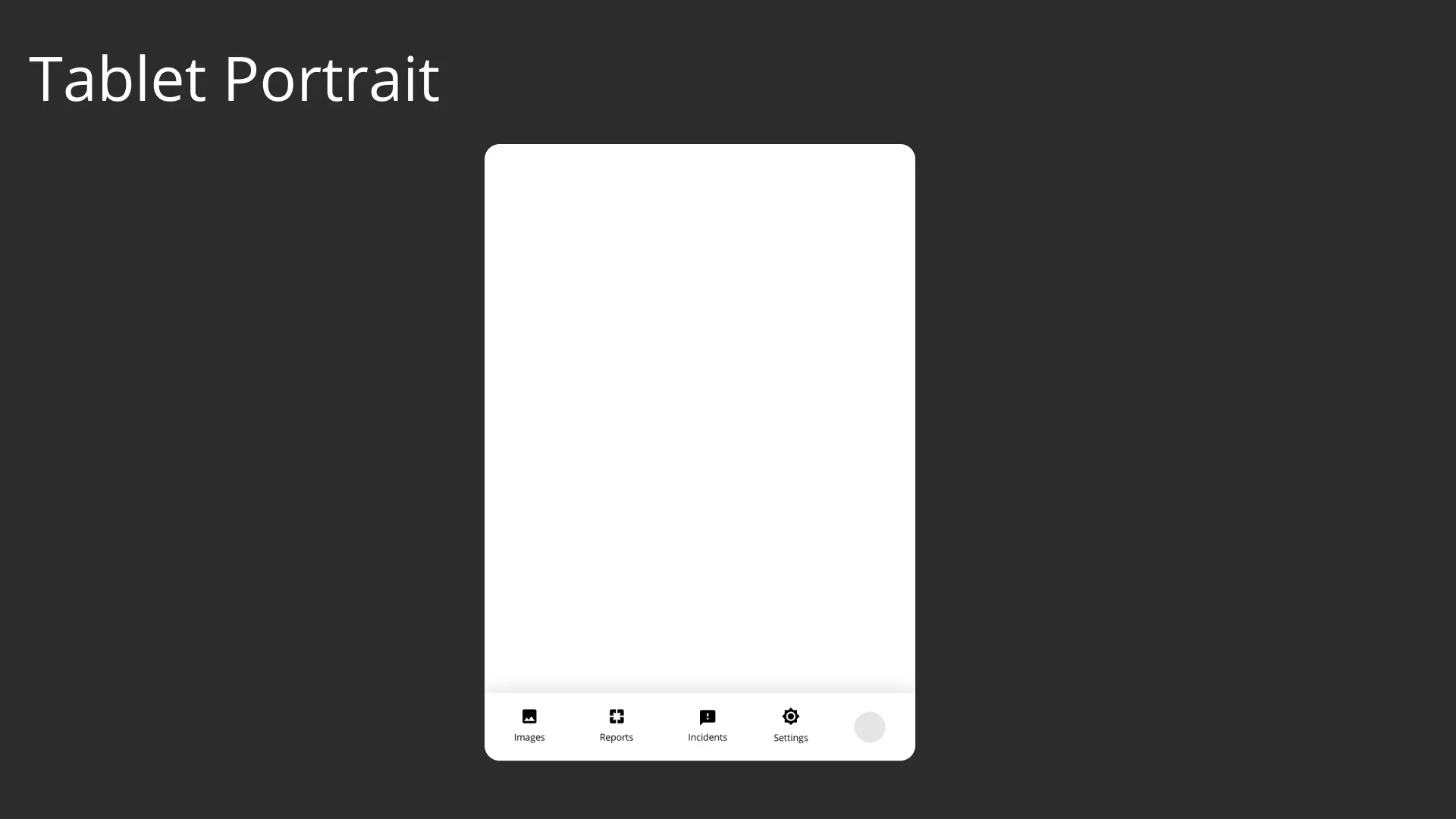
Tablet Screen - Portrait
For the tablet Screen in portrait mode we want the AppDrawer to take up the full width, like a tab bar, and sit at the bottom of the screen for easy access in that mode.
We’ll start off by getting the HomeView tablet layout defined and then move down the tree for the smaller widgets. We’ll use one widget for the Tablet since we’re using the same children in both instances. We can update the HomeView to look like this.
class HomeView extends StatelessWidget {
  HomeView({Key key}) : super(key: key);

  @override
  Widget build(BuildContext context) {
    return ScreenTypeLayout(
      mobile: OrientationLayout(
        portrait: HomeMobilePortrait(),
        landscape: const HomeMobileLandscape(),
      ),
      tablet: const HomeTablet(),
    );
  }
}
The HomeTablet widget will either be a Column in portrait or Row in landscape mode. The children will stay the same. The only difference being that the children are reversed when in Landscape. This is just to show that you can still combine the code for orientations if they have minimal differences. In the home folder create a new file called home_view_tablet.dart
class HomeTablet extends StatelessWidget {
  const HomeTablet({
    Key key,
  }) : super(key: key);

  @override
  Widget build(BuildContext context) {
    var children = [
      Expanded(
        child: Container(),
      ),
      AppDrawer()
    ];
    var orientation = MediaQuery.of(context).orientation;
    return Scaffold(
      body: orientation == Orientation.portrait
          ? Column(
              children: children,
            )
          : Row(
              children: children.reversed.toList(),
            ),
    );
  }
}
At this point we can go ahead and make the root of the AppDrawer a ScreenTypeLayout.
class AppDrawer extends StatelessWidget {
  const AppDrawer({Key key}) : super(key: key);

  @override
  Widget build(BuildContext context) {
    return ScreenTypeLayout(
      mobile: const AppDrawerMobileLayout(),
      tablet: const OrientationLayout(
        portrait: AppDrawerTabletPortrait(),
      ),
    );
  }
}
Create a new file under the app_drawer folder called app_drawer_mobile.dart.
class AppDrawerMobileLayout extends StatelessWidget {
  const AppDrawerMobileLayout({Key key}) : super(key: key);

  @override
  Widget build(BuildContext context) {
    return OrientationBuilder(
      builder: (context, orientation) => Container(
        width: orientation == Orientation.portrait ? 250 : 100,
        decoration: BoxDecoration(
          color: Colors.white,
          boxShadow: [
            BoxShadow(
              blurRadius: 16,
              color: Colors.black12,
            )
          ],
        ),
      ),
    );
  }
}
Create another file, app_drawer_tablet.dart and create a new widget AppDrawerTabletPortrait that defines the Portrait UI.
class AppDrawerTabletPortrait extends StatelessWidget {
  const AppDrawerTabletPortrait({Key key}) : super(key: key);

  @override
  Widget build(BuildContext context) {
    return Container(
      height: 130,
      decoration: BoxDecoration(
        color: Colors.white,
        boxShadow: [
          BoxShadow(blurRadius: 16, color: Colors.black12),
        ],
      ),
    );
  }
}
If you save and run now your drawer should appear at the bottom of the screen when in portrait mode for the tablet.
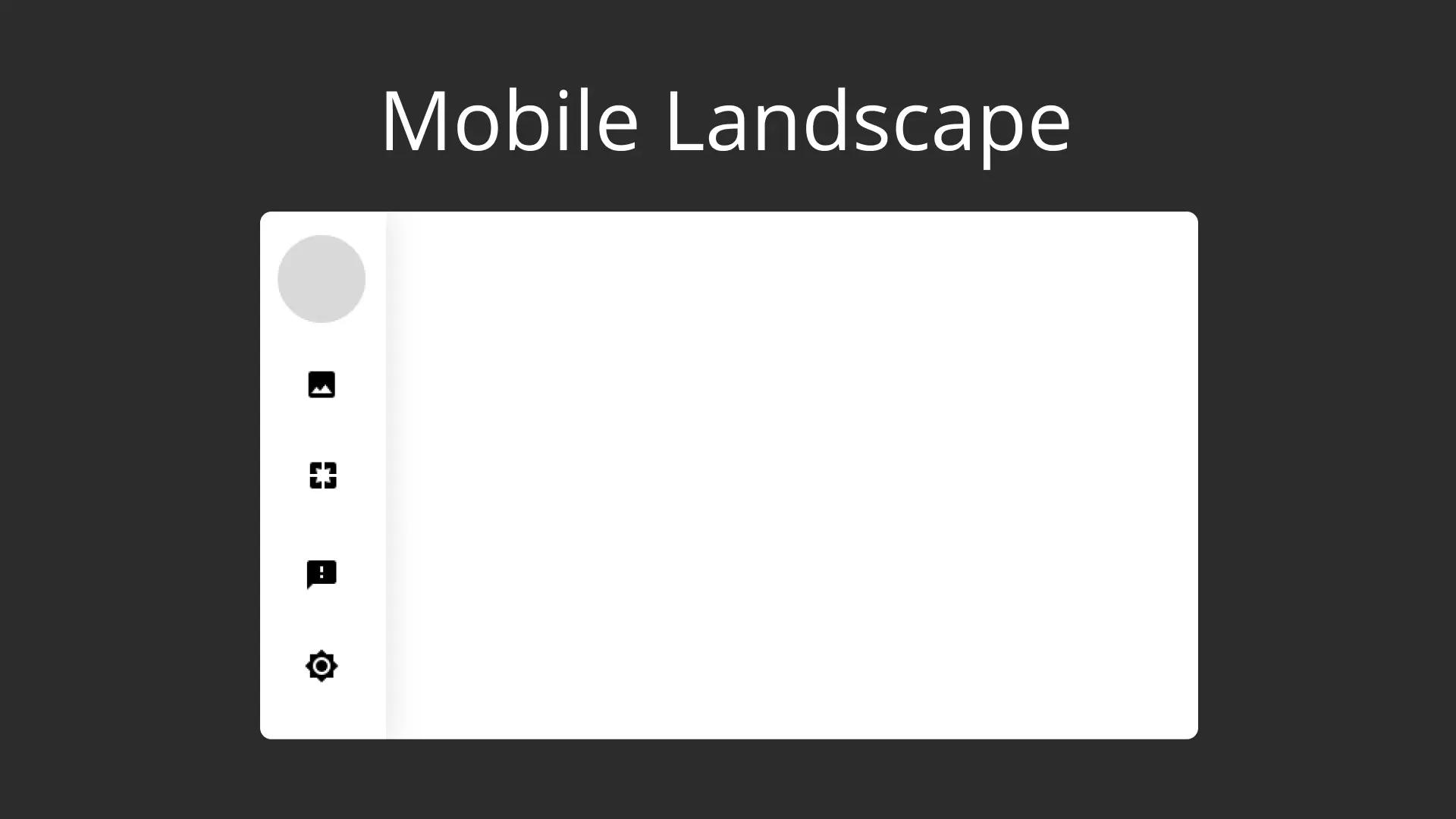
Tablet Screen - Landscape
The last screen to implement for the design is the Landscape Tablet view for the AppDrawer. Open up the AppDrawer and set the landscape value for the tablet orientation to AppDrawerTabletLandscape.
class AppDrawer extends StatelessWidget {
  const AppDrawer({Key key}) : super(key: key);

  @override
  Widget build(BuildContext context) {
    return ScreenTypeLayout(
      mobile: const AppDrawerMobileLayout(),
      tablet: const OrientationLayout(
        portrait: const AppDrawerTabletPortrait(),
        landscape: const AppDrawerTabletLandscape(),
      ),
    );
  }
}
Then we can create the Landscape widget in the app_drawer_tablet file and set the width to 250.
class AppDrawerTabletLandscape extends StatelessWidget {
  const AppDrawerTabletLandscape({Key key}) : super(key: key);

  @override
  Widget build(BuildContext context) {
    return Container(
      width: 250,
      decoration: BoxDecoration(
        color: Colors.white,
        boxShadow: [
          BoxShadow(blurRadius: 16, color: Colors.black12),
        ],
      ),
    );
  }
}
The reason I didn’t use the OrientationLayout directly this time, was to show how much better it reads in code using the Layout. Just think about how many screens you’ll have, having something that reads like this over time will help those future unintentional bugs that might come up when your web tester is resizing the view over and over to find the flaws.
🎉 Responsive View Layout Complete 🎉
That’s how I will be handling responsive projects going forward in production. Instead of using the MediaQuery directly I wanted something more readable and this is a step in that direction. Now lets build the Responsive Drawer Items. We know exactly how they should look in all 4 of the combinations we have. We can start off the widgets code with both Layout widgets and get all the boilerplate out of the way. Under the widgets folder create a new folder called drawer_option. In there Create a new file called drawer_option.dart, drawer_option_mobile.dart and drawer_option_tablet.dart.
In the drawer_option.dart file create a new stateless widget called DrawerOption.
class DrawerOption extends StatelessWidget {
  final String title;
  final IconData iconData;
  const DrawerOption({
    Key key,
    this.title,
    this.iconData,
  }) : super(key: key);

  @override
  Widget build(BuildContext context) {
    return ScreenTypeLayout(
      mobile: OrientationLayout(
        portrait: DrawerOptionMobilePortrait(),
        landscape: DrawerOptionMobileLandscape(),
      ),
      tablet: OrientationLayout(
        portrait: DrawerOptionTabletPortrait(),
        landscape: DrawerOptionTabletLandscape(),
      ),
    );
  }
}
In the drawer_option_mobile file we’ll create DrawerOptionMobilePortrait. It’s a Container with height 80 and a row with an icon and text inside. It takes in a title and icon data.
class DrawerOptionMobilePortrait extends StatelessWidget {
  final String title;
  final IconData iconData;
  const DrawerOptionMobilePortrait({
    Key key,
    this.title,
    this.iconData,
  }) : super(key: key);

  @override
  Widget build(BuildContext context) {
    return Container(
      padding: const EdgeInsets.only(left: 25),
      height: 80,
      child: Row(
        children: <Widget>[
          Icon(
            iconData,
            size: 25,
          ),
          SizedBox(
            width: 25,
          ),
          Text(
            title,
            style: TextStyle(fontSize: 21),
          )
        ],
      ),
    );
  }
}
In the same drawer_option_mobile file create the DrawerOptionMobileLandscape. It’s a container (height 70) with an icon inside aligned to the centre.
class DrawerOptionMobileLandscape extends StatelessWidget {
  final IconData iconData;
  const DrawerOptionMobileLandscape({Key key, this.iconData}) : super(key: key);

  @override
  Widget build(BuildContext context) {
    return Container(
      height: 70,
      alignment: Alignment.center,
      child: Icon(iconData, size: 30,),
    );
  }
}
Then we can move onto the Tablet version. in the drawer_option_tablet file create a new widget.
class DrawerOptionTabletPortrait extends StatelessWidget {
  final String title;
  final IconData iconData;
  const DrawerOptionTabletPortrait({
    Key key,
    this.title,
    this.iconData,
  }) : super(key: key);

  @override
  Widget build(BuildContext context) {
    return Container(
      width: 152,
      alignment: Alignment.center,
      child: Column(
        mainAxisSize: MainAxisSize.min,
        children: <Widget>[
          Icon(
            iconData,
            size: 45,
          ),
          Text(title, style: TextStyle(fontSize: 20)),
        ],
      ),
    );
  }
}
And for the Tablet Landscape widget we’ll supply the DrawerOptionMobilePortrait widget since it’s the same. Your DrawerOption class should now look like this.
class DrawerOption extends StatelessWidget {
  final String title;
  final IconData iconData;
  const DrawerOption({
    Key key,
    this.title,
    this.iconData,
  }) : super(key: key);

  @override
  Widget build(BuildContext context) {
    return ScreenTypeLayout(
      mobile: OrientationLayout(
        portrait: DrawerOptionMobilePortrait(
          title: title,
          iconData: iconData,
        ),
        landscape: DrawerOptionMobileLandscape(
          iconData: iconData,
        ),
      ),
      tablet: OrientationLayout(
        portrait: DrawerOptionTabletPortrait(
          title: title,
          iconData: iconData,
        ),
        landscape: DrawerOptionMobilePortrait(
          title: title,
          iconData: iconData,
        ),
      ),
    );
  }
}
Then to wrap up we can go over to the AppDrawer create a static function getDrawerOptions that returns all our options.
class AppDrawer extends StatelessWidget {
  ...

  static List<Widget> getDrawerOptions() {
    return [
      DrawerOption(
        title: 'Images',
        iconData: Icons.image,
      ),
      DrawerOption(
        title: 'Reports',
        iconData: Icons.photo_filter,
      ),
      DrawerOption(
        title: 'Incidents',
        iconData: Icons.message,
      ),
      DrawerOption(
        title: 'Settings',
        iconData: Icons.settings,
      ),
    ];
  }
}
For the AppDrawer mobile layout in app_drawer_mobile we can now set the child as a column with the drawer options as children.
class AppDrawerMobileLayout extends StatelessWidget {
  @override
  Widget build(BuildContext context) {
    var orientation = MediaQuery.of(context).orientation;
    return Container(
      ...
      child: Column(
        children: AppDrawer.getDrawerOptions(),
      ),
    );
  }
}
for the Tablet Portrait widget of the AppDrawer we can do the same but we’ll use a Row instead.
class AppDrawerTabletPortrait extends StatelessWidget {
  @override
  Widget build(BuildContext context) {
    return Container(
      ...
      child: Row(
        children: AppDrawer.getDrawerOptions(),
      ),
    );
  }
}
And for Tablet Landscape widget of the AppDrawer we’ll use a column along with the children.
class AppDrawerTabletLandscape extends StatelessWidget {
  @override
  Widget build(BuildContext context) {
    return Container(
      ...
      child: Column(
        children: AppDrawer.getDrawerOptions(),
      ),
    );
  }
}
That’s it. You should be able to swap between all the orientations now for Mobile and Tablet and see a different UI. I’m leaving out the DrawerProfileItem so that you can do that as practice. The goal was to make responsive UI building more readable, check. Separate the layouts from each other to avoid massive conditional ridden UI files, check. Allow for a long term maintainable codebase, maybe check? We’ll see in the next few months during production development.
Please let me know what you think. Come over to the Slack, Subscribe on YouTube. I build these architectures for clients and I like sharing them :)
Until next week.