
Today I want to go over my solution to provide Sizing information at a base widget level so it can easily be incorporated into any architecture. This tutorial will not be to make a UI appear exactly the same on every screen size. It will actually be the opposite. I would like to provide myself with enough information to intelligently modify my UI’s appearance based on screen sizing. I want to do this at an view (screen) level as well as a widget level.
The Problem
The question that we’re answering today is “How can we provide all relevant information at a widget level to modify our UI?“.
The Solution
Provide a BaseWidget that gives you the opportunity to build your UI using custom ScreenInformation compiled by you specifically for that goal. Instead of making use of the the MediaQuery in every widget and view file we will build it into the BaseWidget and build SizingInformation object that will be available to every widget using the BaseWidget.
Lets go over what we’d like to provide in the SizingInformation and also why we would want this information:
- Orientation: We want to be able to easily determine which layout to show based on the current orientation. Possible values Landscape and Portrait.
- DeviceScreenType: This will reflect the Screen Type we are displaying on. Not the physical device screen but the display type .i.e. Mobile, Tablet, Desktop
- ScreenSize: This reflects the total size of the current screen the app is being displayed on
- LocalWidgetSize: This reflects the bounds that the current widget is being drawn in. It will allow you to make smart UI choices at the widget level as well, such as hiding text in a Icon+Text widget and instead increasing the icon size for much smaller screens.
Implementation
To implement the functionality we will make use of two Flutter provided sets of Functionality.
MediaQuery: This provides us with some valuable information, most importantly theOrientationandScreenSize. We’ll use this to determine the first 3 info points mentioned above.LayoutBuilder: This widget provides us with a builder that also gives us BoxConstraints which indicate to use the Bounds the current widget is taking up. We’ll use the bounds from the Builder to create ourLocalWidgetSizevalue and pass that back.
With that in mind lets start the implementation.
SizingInformation
Before we can create the SizingInformation we need an enum that represents our DeviceScreenType. Under the lib folder create a new folder called enums, inside create a new file, device_screen_type.dart (naming can definitely change).
enum DeviceScreenType {
  Mobile,
  Tablet,
  Desktop
}
Then create a new folder under lib called ui and inside create a new file called sizing_information.dart
import 'package:flutter/widgets.dart';
import 'package:response_architecture/enums/device_screen_type.dart';

class SizingInformation {
  final Orientation orientation;
  final DeviceScreenType deviceType;
  final Size screenSize;
  final Size localWidgetSize;

  SizingInformation({
    this.orientation,
    this.deviceType,
    this.screenSize,
    this.localWidgetSize,
  });

  @override
  String toString() {
    return 'Orientation:$orientation DeviceType:$deviceType ScreenSize:$screenSize LocalWidgetSize:$localWidgetSize';
  }
}
Now that the model is done lets setup the builder that we’ll use to build our UI for us.
UI Architecture
We’ll start by creating a StatelessWidget under the ui folder called BaseWidget. It will take in a Function that returns a widget, that function will be named builder. The parameters to the function will be the BuildContext and the SizingInformation. For the build method we will execute that builder and return the widget it produces.
import 'package:flutter/material.dart';
import 'package:response_architecture/ui/sizing_information.dart';

class BaseWidget extends StatelessWidget {
  final Widget Function(
      BuildContext context, SizingInformation sizingInformation) builder;
  const BaseWidget({Key key, this.builder}) : super(key: key);

  @override
  Widget build(BuildContext context) {
    var sizingInformation = SizingInformation();
    return builder(context, sizingInformation);
  }
}
Then we can setup a simple home_view to see how we’ll make use of this. Under the ui folder create a new file called home_view.dart
import 'package:flutter/material.dart';
import 'package:response_architecture/ui/base_widget.dart';
class HomeView extends StatelessWidget {
const HomeView({Key key}) : super(key: key);
@override
Widget build(BuildContext context) {
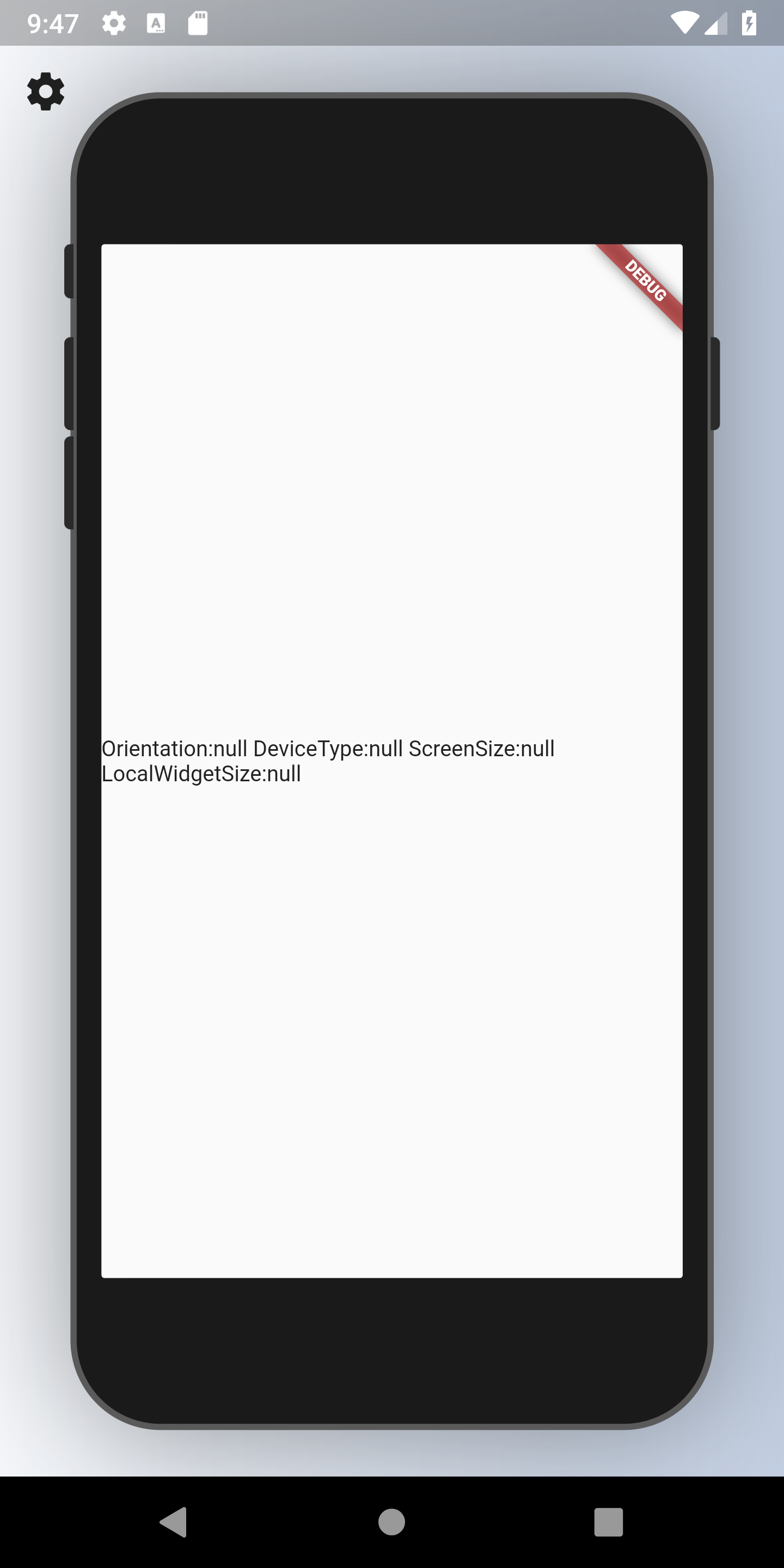
return BaseWidget(builder: (context, sizingInformation) {
return Scaffold(
body: Center(
child: Text(sizingInformation.toString()),
));
});
}
}
Before we test we’ll setup a package that helps us to easily test our layouts. This will be used in development for quick UI testing only, majority of your testing should still be on the real devices, if not possible the emulator or the Web to easily test all sizes. We’ll add the Device Preview package to the pubspec.
device_preview: 0.1.9-betaThen in the main file we’ll follow the instructions, wrap the App in Device preview and supply it with the appBuilder from the package. Make sure your home file looks like below.
void main() => runApp(
      DevicePreview(
        child: MyApp(),
      ),
    );

class MyApp extends StatelessWidget {
  // This widget is the root of your application.
  @override
  Widget build(BuildContext context) {
    return MaterialApp(
      builder: DevicePreview.appBuilder,
      title: 'Flutter Demo',
      home: HomeView(),
    );
  }
}
You should be seeing a preview like below if you’re using an Android emulator. I’d recommend spinning up a Tablet sized AVD but a basic emulator works fine for me when it’s sized to be as big as possible.
If you click in the top left corner on the cog icon you can rotate the device, change the device and see how the UI responds in milliseconds. Now lets move on to gathering the information and populating the SizingInformation.
Populating the Information
We’ll start off by passing in our Orientation.
var mediaQuery = MediaQuery.of(context);
var sizingInformation = SizingInformation(
  orientation: mediaQuery.orientation,
);
Then we’ll determine the DeviceType with a top-level function stored in the ui_utils.dart file under the utils folder. The way we determine the device we’re on is through the width of the device. Since the mediaQuery.size doesn’t return the size of the physical device, we have to make sure we’re using the correct dimensions. We determine the screen type by the width of the device. Since the width of the screen will reflect differently based on the orientation we will use either the width or height depending on the orientation. When the device is in portrait we can use the width to determine the width of the device. When it’s in landscape we have to use the screen height to determine the width of the device.
DeviceScreenType getDeviceType(MediaQueryData mediaQuery) {
  var orientation = mediaQuery.orientation;

  double deviceWidth = 0;

  if (orientation == Orientation.landscape) {
    deviceWidth = mediaQuery.size.height;
  } else {
    deviceWidth = mediaQuery.size.width;
  }

  if (deviceWidth > 950) {
    return DeviceScreenType.Desktop;
  }

  if (deviceWidth > 600) {
    return DeviceScreenType.Tablet;
  }

  return DeviceScreenType.Mobile;
}
In the BaseWidget we can now get the devicesScreenType from using this function and passing in the MediaQuery. We can also pass the screen size.
var mediaQuery = MediaQuery.of(context);
var sizingInformation = SizingInformation(
  orientation: mediaQuery.orientation,
  deviceType: getDeviceType(mediaQuery),
  screenSize: mediaQuery.size,
);
If you reload your code now and change the sizing to an ipad Air2 you’ll see DeviceType.Tablet on the screen, the correct orientation etc. The only thing left is the LocalWidgetSize. And for that we’ll require the LayoutBuilder mentioned in the beginning.
Instead of executing the builder function and returning that we’ll return the LayoutBuilder as the root widget and for it’s builder we’ll execute and return the function passed in along with the BoxConstraints converted into a Size object.
Widget build(BuildContext context) {
  var mediaQuery = MediaQuery.of(context);

  return LayoutBuilder(builder: (context, boxSizing) {
    var sizingInformation = SizingInformation(
      orientation: mediaQuery.orientation,
      deviceType: getDeviceType(mediaQuery),
      screenSize: mediaQuery.size,
      localWidgetSize: Size(boxSizing.maxWidth, boxSizing.maxHeight),
    );

    return builder(context, sizingInformation);
  });
}
If you reload the code now you’ll see the correct sizing information required. If you want to see how we build a responsive UI using this setup subscribe to the FilledStacks YouTube channel, to see how I build a responsive UI.