
In this tutorial we’ll be going through the mental process of breaking down a UI using TikTok as an example :)
Over the past few months I’ve been using Flutter and learning how to use the SDK. I’ve been active on StackOverflow helping fellow Flutter beginners and getting some knowledge myself and the most common question I’ve seen is “How do I make my UI look like this [screenshot]?”. Those questions almost never get answered because it would take some time to adjust / tweak a layout to look exactly like a screenshot.
Since I started using Flutter I’ve had no problem replicating any UI that I’ve seen. I attribute that to the break down process that I follow. In this post I will share the steps that I follow to break down a UI and make development easier to manage and maintain.
If you want to follow along I’ve setup a repo on Github with the tutorial code in it. Clone it, go into the tik_tok_ui project , drag phase1 into your IDE and code with me. Make sure to run flutter packages get before you start to get all dependencies.
Let’s get going.
Breaking down the UI
When it comes to implementing anything in code it’s always a good idea to break down the problem into smaller pieces. The same goes for UI. Below is an image that shows you the process that I follow to break down a UI (mentally) before I start implementing.
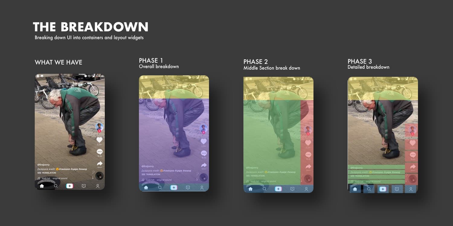
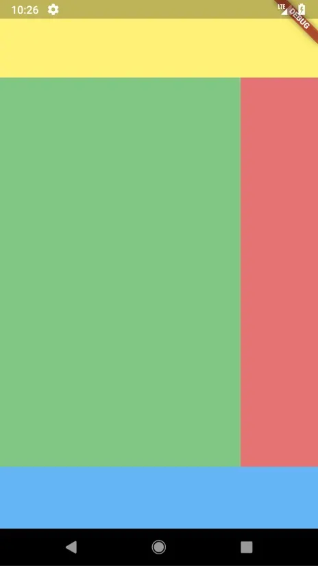
Phase 1: This is the breakdown of the overall page body, if you can see any logical ordering then that’s what you go with. For us it’s (like most apps) a Column with the widgets stacked onto each other. The top and bottom parts will have a fixed height and the middle section will be expandable.
Phase 2: The second widget in the column can be broken down into two other sections, so we’ll add a Row for that.
The above two phases are very close to each other so we’ll add the code in one go. We’ll use a container for the top and bottom sections because we want a fixed size. We will then used an Expandable for the middle section because we want it to take up all remaining space. Finally, we want our widgets in the middle section at the bottom (end) of the Row, so we set our crossAxisAlignment to CrossAxisAlignment.end.
Widget build(BuildContext context) {
  return Scaffold(
    body: Column(
      children: <Widget>[
        // Top section
        Container(
          height: 100.0,
          padding: EdgeInsets.only(bottom: 15.0),
          color: Colors.yellow[300],
        ),

        // Middle expanded
        Expanded(
        child: Row(
            mainAxisSize: MainAxisSize.max,
            crossAxisAlignment: CrossAxisAlignment.end,
            children: <Widget>[
          Expanded(child: Container(color: Colors.green[300])),
          Container(
            width: 100.0,
            color: Colors.red[300],
          )
        ])),

        // Bottom Section
        Container(height: 80.0, color: Colors.blue[300]),
      ],
    ),
  );
}
You should being seeing a result similar to this.
Let’s do a bit of cleanup to make things neater. We’ll move each of the sections marked by the comments into its own property getter just above the build method.
Widget get topSection => Container(
        height: 100.0,
        padding: EdgeInsets.only(bottom: 15.0),
        color: Colors.yellow[300],
      );

  Widget get middleSection => Expanded(
          child: Row(
              mainAxisSize: MainAxisSize.max,
              crossAxisAlignment: CrossAxisAlignment.end,
              children: <Widget>[
            Expanded(child: Container(color: Colors.green[300])),
            Container(
              width: 100.0,
              color: Colors.red[300],
            )
          ]));

  Widget get bottomSection => Container(height: 80.0, color: Colors.blue[300]);
Your build method should now look like this
 @override
 Widget build(BuildContext context) {
  return Scaffold(
    body: Column(
      children: <Widget>[
        // Top section
        topSection,

        // Middle expanded
        middleSection,

        // Bottom Section
        bottomSection,
      ],
    ),
  );
}
Phase 3: This is the final phase of the overall layout. In this phase there’s a bit more details to how we want to divide up the remaining spaces.
Middle section: Before we continue I want to move the children of the middle row into its own properties as well. Change your middleSection property to look like this.
Widget get videoDescription =>  Expanded(child: Container(color: Colors.green[300]));

Widget get actionsToolbar => Container(
    width: 100.0,
    color: Colors.red[300],
  );

Widget get middleSection => Expanded(
  child: Row(
      mainAxisSize: MainAxisSize.max,
      crossAxisAlignment: CrossAxisAlignment.end,
      children: <Widget>[
    videoDescription,
    actionsToolbar
  ]));
After getting everything neat again we can start adding the details for each section’s items.
Always keep things neat, it can get messy very quickly.
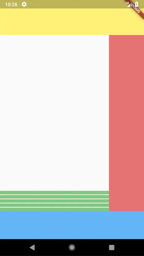
Video Description (Green)
Our video description container is currently an expanded widget with a container in it to show the area that it takes up. In the screenshot UI the video description can be seen as a column of widgets stacked on top of each other with some spacing in between. Change your videoDescription to look like this.
Widget get videoDescription =>  Expanded(
  child: Column(
      mainAxisSize: MainAxisSize.min,
      crossAxisAlignment: CrossAxisAlignment.start,
      children: <Widget>[
        Container(height: 10.0, color: Colors.green[300], margin: EdgeInsets.only(top: 10)),
        Container(height: 10.0, color: Colors.green[300], margin: EdgeInsets.only(top: 10)),
        Container(height: 10.0, color: Colors.green[300], margin: EdgeInsets.only(top: 10))
    ]),
);
Here we replaced our Container with a Column that has three Containers as children to indicate how it will look visually.
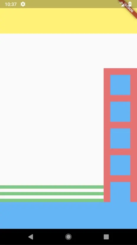
Actions Toolbar
This is 5 widgets stacked in a Column. We could do the same as we did above with the duplication of the Containers but luckily dart provides nice generation functionality so I’ll use a list generator instead. Change your actionsToolbar to the following.
 Widget get actionsToolbar => Container(
      width: 100.0,
      color: Colors.red[300],
      child: Column(
            mainAxisSize: MainAxisSize.min,
            children: List<Widget>.generate(5, (index) => Container(
              width: 60, height: 60,
              color: Colors.blue[300],
              margin: EdgeInsets.only(top: 20.0))),
          ),
    );
What we’re doing here is Generating a list of length 5, the generator returns a Container and we provide that list to the Column.
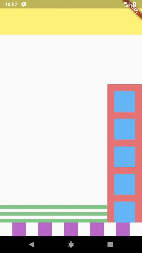
Bottom Section: This a row of widgets next to each other, it’s not much different from the toolbar section above. Change your bottom section to the code below.
Widget get bottomSection => Row(
    mainAxisAlignment: MainAxisAlignment.spaceEvenly,
    children: List<Widget>.generate(5, (index) => Container(
      width: 40.0, height: 40.0,
      color: Colors.purple[300])),
  );
Organise the code base
Now that we’ve gone through the mental process of breaking down our UI into sections, we can logically group some of the code into custom widgets to keep everything neat and easy to maintain through the development of the UI.
Video Description: This widget contains a column with text children inside.
Actions Toolbar: This is a fixed width widget on the right hand side of the screen that contains the actions that can be performed from each video.
Bottom Toolbar (Not named Navigation Toolbar because it clashes with a Flutter widget in the library): This is a fixed height widget at the bottom of the screen that contains the main application icons / actions.
Splitting our files
We’ll start by splitting all the proposed widgets into a folder called widgets where all our widgets will live. Create a folder under lib called widgets. This is what we’re going for
Video Description: Create a new file named video_description.dart under the widgets folder and move the code from the videoDescription property into the new file’s build method.
import 'package:flutter/material.dart';

class VideoDescription extends StatelessWidget {
  @override
  Widget build(BuildContext context) {
    return Expanded(
      child: Column(
          mainAxisSize: MainAxisSize.min,
          crossAxisAlignment: CrossAxisAlignment.start,
          children: <Widget>[
            Container(
                height: 10.0,
                color: Colors.green[300],
                margin: EdgeInsets.only(top: 10)),
            Container(
                height: 10.0,
                color: Colors.green[300],
                margin: EdgeInsets.only(top: 10)),
            Container(
                height: 10.0,
                color: Colors.green[300],
                margin: EdgeInsets.only(top: 10))
          ]),
    );
  }
}
Actions Toolbar: Create a file named actions_toolbar.dart under the widgets folder and move the code from the actionsToolbar property into the build method.
import 'package:flutter/material.dart';

class ActionsToolbar extends StatelessWidget {
  @override
  Widget build(BuildContext context) {
    return Container(
      width: 100.0,
      color: Colors.red[300],
      child: Column(
        mainAxisSize: MainAxisSize.min,
        children: List<Widget>.generate(
            5,
            (index) => Container(
                width: 60,
                height: 60,
                color: Colors.blue[300],
                margin: EdgeInsets.only(top: 20.0))),
      ),
    );
  }
}
Bottom Toolbar: And lastly, create a file named bottom_toolbar.dart under the widgets folder and move the code from bottomSection into the build method.
import 'package:flutter/material.dart';

class BottomToolbar extends StatelessWidget {
  @override
  Widget build(BuildContext context) {
    return Row(
      mainAxisAlignment: MainAxisAlignment.spaceEvenly,
      children: List<Widget>.generate(
          5,
          (index) =>
              Container(width: 40.0, height: 40.0, color: Colors.purple[300])),
    );
  }
}
Now that we have all the files ready lets update the Home widget to use our components. First we’ll import the components from widgets, then we’ll remove the videoDescription property and the actionsToolbar property as well as the bottomSection property and replace them with the widgets we have created. Your middleSection and build function in Home should now look like this.
import 'package:tik_tok_ui/widgets/video_description.dart';
import 'package:tik_tok_ui/widgets/actions_toolbar.dart';
import 'package:tik_tok_ui/widgets/bottom_toolbar.dart';

...

Widget get middleSection => Expanded(
  child: Row(
      mainAxisSize: MainAxisSize.max,
      crossAxisAlignment: CrossAxisAlignment.end,
      children: <Widget>[
    VideoDescription(),
    ActionsToolbar()
  ]));

@override
Widget build(BuildContext context) {
  return Scaffold(
    body: Column(
      children: <Widget>[
        // Top section
        topSection,

        // Middle expanded
        middleSection,

        // Bottom Section
        BottomToolbar(),
      ],
    ),
  );
}
At this point we have the complete layout organized and can start adding the minor details. I’ll leave that for the next post, which I’m almost done writing.
Next post we’ll go from the overall layout to adding the final touches to match your designs as close as possible.
Please give me some claps if this helped you in any way, and please follow to get all my future tutorials and guides.
The code for this tutorial can be found here.
Thank you for reading. Check out part 2 here.