
Text is a very important part of any mobile app UI. In this guide I’ll go over all the ways text can be modified in Flutter and applying global text themes. To show text in Flutter you use the Text Widget.
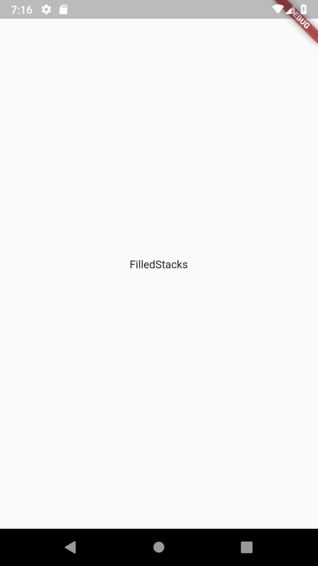
Text('FilledStacks')This will show the text on the screen using the default text for the OS. Roboto on Android and Helvetiva Neue on iOS. Let’s start playing around. Create a build method like this so you can see what’s happening with all the changes.
  @override
  Widget build(BuildContext context) {
    return MaterialApp(
      home: Scaffold(
        body: Center(child: Text('FilledStacks')),
      ),
    );
  }
You should be seeing something like this.
Size, FontWeigt, Color and Style
The way you customise the Text is by supplying the text widget with a TextStyle. There’s a lot of properties you can change but we’ll go over the most common ones. We’ll change the color to a grey, make the font bold and increase the font size.
Text(
  'FilledStacks',
  style: TextStyle(
      color: Colors.grey[800],
      fontWeight: FontWeight.bold,
      fontSize: 40)
FontWeight
Font weight has multiple values that can be supplied using the FontWeight consts. In addition to bold and normal you can supply actual weights by using FontWeight.w[weightValue] i.e. FontWeight.w900 for heavy font bolder than bold.
FontStyle
The font style is what you’ll use to make the text italic fontStyle: FontStyle.italic.
Custom Fonts
To use custom fonts is a 2 step process. Copy over the assets and declare in the pubspec file. Then supply the font family. The fonts can be placed in the assets folder in the root of the project under a fonts folder to keep everything organized.
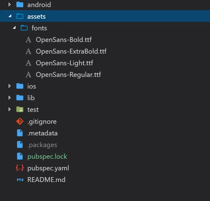
Then you import these assets into the app through the pubspec assets section. Scroll down in the pubspec file and you’ll see some commented out font related text. That’s where you’ll import your fonts.
fonts:
  - family: Open Sans
    fonts:
      - asset: assets/fonts/OpenSans-Bold.ttf
        weight: 700
      - asset: assets/fonts/OpenSans-ExtraBold.ttf
        weight: 800
      - asset: assets/fonts/OpenSans-Light.ttf
        weight: 300
      - asset: assets/fonts/OpenSans-Regular.ttf
        weight: 400
The fonts will all be declared under a shared family, Open Sans in the case above. Then you declare all the fonts under the fonts property and list each version of the font using a hyphen followed by asset: and the weight:. The value you asign to the weight here, is the value you should use when setting your fontWeight in the TextStyle as shown above. Here when you set fontWeight: FontWeight.w300 the font that will be used is assets/fonts/OpenSans-Light.ttf.
Now if you want to use the font you have to set your fontFamily equal to the family name assigned in the pubspec.
TextStyle(
  color: Colors.grey[800],
  fontWeight: FontWeight.w900,
  fontStyle: FontStyle.italic,
  fontFamily: 'Open Sans',
  fontSize: 40),
Global Theming
You probably wouldn’t want to set the text style for every single Text widget you use in the app, luckily Flutter makes that easy for us to handle. In your main app when you supply your Material app you can optionally provide a theme. When doing this you can take the current theme and apply some additional changes to it so that you still inherit most of the Theming besides the small changes you want to make.
Lets say that I want to make all my text white, and give it the Open Sans font family. That can be easily achieved like this.
class MyApp extends StatelessWidget {
  @override
  Widget build(BuildContext context) {
    return MaterialApp(
        title: 'Skeleton Watcher',
        theme: ThemeData(
          // Use the old theme but apply the following three changes
            textTheme: Theme.of(context).textTheme.apply(
                fontFamily: 'Open Sans',
                bodyColor: Colors.white,
                displayColor: Colors.white)),
        home: HomeView());
  }
}
Here we’re setting the fontFamily, the displayColor and the main bodyColor of the text all to white.
Other customisations
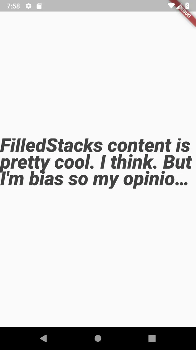
Modifying the appearance of the text through the style is not always the only thing we want to do. Sometimes we need to modify the wrapping, set the max number of lines and add elipses. The text widget itself has properties for this. Let’s add some big text with multiple lines that we’ll stop at 3 lines max and add elipses at the end. this can easily be done like this.
Text(
  'FilledStacks content is pretty cool. I think. But I\'m bias so my opinion doesn\'t really count.',
  maxLines: 3,
  overflow: TextOverflow.ellipsis,
  style: TextStyle(
      color: Colors.grey[800],
      fontWeight: FontWeight.w900,
      fontStyle: FontStyle.italic,
      fontFamily: 'Open Sans',
      fontSize: 40),
)),
And that’s it. That’s all I’ve needed so far to make my text look nice.
Checkout and subscribe to my Youtube Channel. Follow me on Instagram for snippets and day-to-day programming. Checkout all the other snippets here. You might find some more Flutter magic.