
In this tutorial we’ll do what you see above. Go from general layout and structure to matching your designs “Perfectly”.
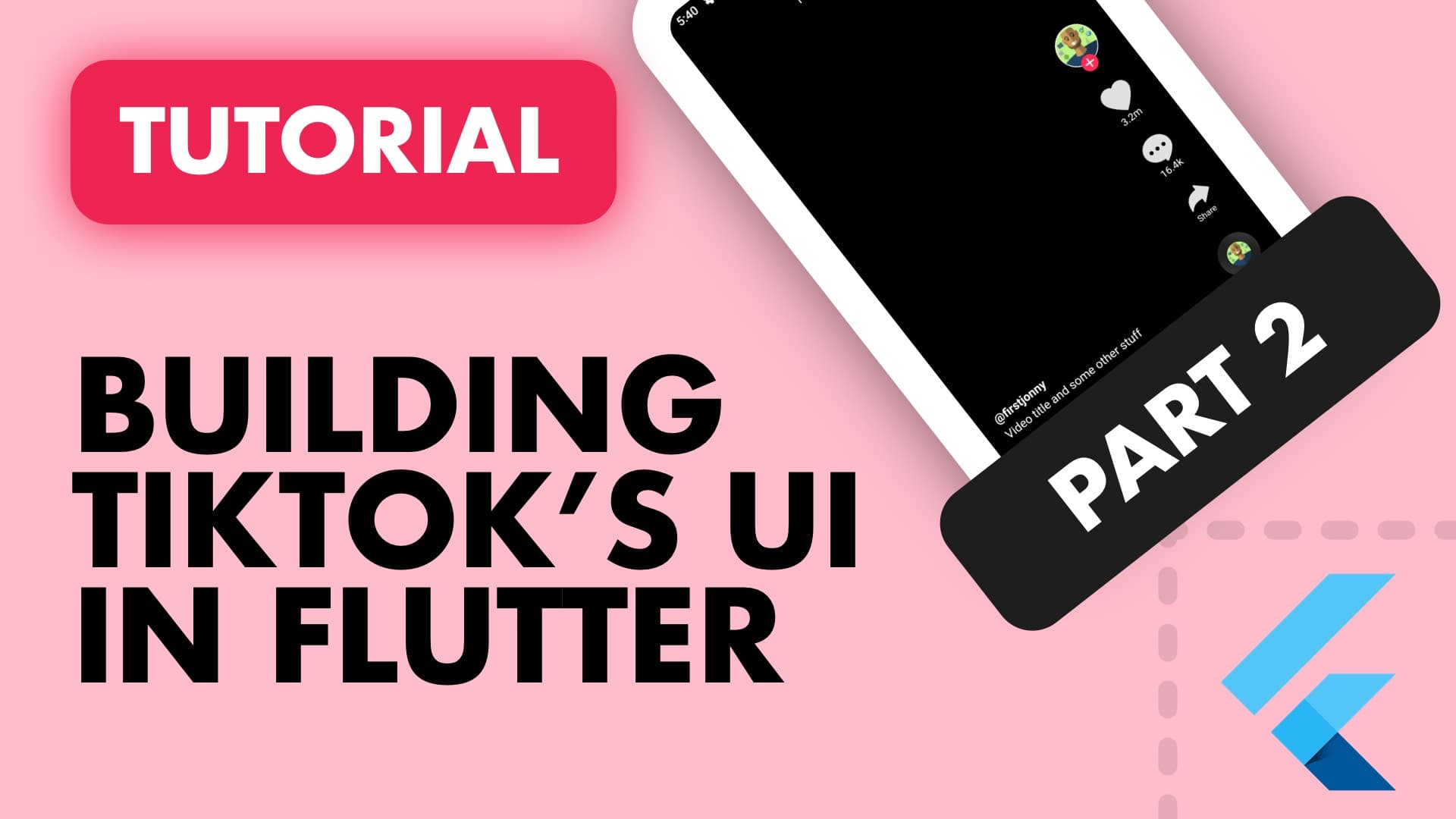
This tutorial is a continuation of part 1, where we broke the UI down into larger containers and finally into it’s own widgets. If you didn’t follow along with the previous tutorial go to this repo and clone it. Open the tik_tok_ui folder and drag phase2 into your IDE and you’re ready to go. When you run the project you should be seeing all the containers filled with colours in the position our final widgets will be.
So lets use all this setup and produce our desired result.
Video Description
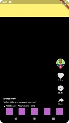
We’ll start by replacing the containers in video_description.dart with Text widgets. We’ll make the last widget a row so that we can add a music note icon in front of the text. All three text entries have a different style so we’ll also add the TextStyles to each widget.
import 'package:flutter/material.dart';

class VideoDescription extends StatelessWidget {
  @override
  Widget build(BuildContext context) {
    return Expanded(
      child: Column(
          mainAxisSize: MainAxisSize.min,
          crossAxisAlignment: CrossAxisAlignment.start,
          children: <Widget>[
            Text('@firstjonny', style: TextStyle(fontWeight: FontWeight.bold),),
            Text('Video title and some other stuff'),
            Row(children: [
            Icon(Icons.music_note,  size: 15.0),
            Text('Artist name - Album name - song', style: TextStyle(fontSize: 12.0))]),
          ]),
    );
  }
}
If you look at the UI at this point you’ll see that there’s no spacing between the lines of text and it’s also tight against the left side of the view. To fix this we wrap the column in a Container, give it a fixed height so we can tell the Column to space the children evenly. Additionally we add padding to the container to give it space on the left side.
Widget build(BuildContext context) {
  return Expanded(
    child: Container(
      height: 70.0,
      padding: EdgeInsets.only(left: 20.0),
      child: Column(
          mainAxisSize: MainAxisSize.min,
          mainAxisAlignment: MainAxisAlignment.spaceEvenly,
          crossAxisAlignment: CrossAxisAlignment.start,

          children: <Widget>[
            Text('@firstjonny', style: TextStyle(fontWeight: FontWeight.bold),),
            Text('Video title and some other stuff'),
            Row(children: [
            Icon(Icons.music_note,  size: 15.0),
            Text('Artist name - Album name - song', style: TextStyle(fontSize: 12.0))]),
          ])
    )
  );
}
No screenshot for this you should be seeing three lines of black text with an icon on the white background.
Actions Toolbar
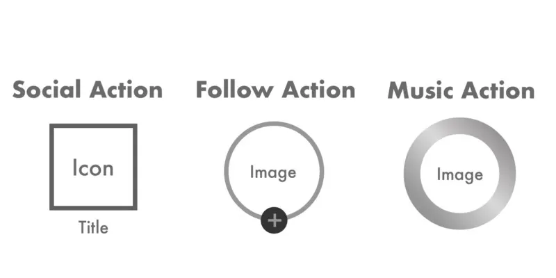
This is definitely where the most of the work has to be done. We have to build three differently style ActionItems to use.
- FollowAction: Rounded Image icon with a border and a round plus sign.
- SocialAction: One of the three social actions you can perform on the video. An icon at the top with a text field below it.
- MusicAction. Also a rounded image (smaller than profile) with a gradient in the background border to make it look like a record.
Social Action
In the actions_toolbar.dart file create a function that returns a Widget called _getSocialAction. The function should take in a String title and IconData icon. This Container will have a topMargin of 15.0, width and height of 60.0 and have a Column as the child. The first child in the column will be the Icon with the data passed in and then the title text.
Widget _getSocialAction({
    String title,
    IconData icon}) {
  return Container(
      margin: EdgeInsets.only(top: 15.0),
      width: 60.0,
      height: 60.0,
      child: Column(children: [
        Icon(icon,  size: 35.0, color: Colors.grey[300]),
        Padding(
          padding: EdgeInsets.only(top:  2.0),
          child: Text(title, style: TextStyle(fontSize: 12.0)),
        )
        ]));
}
Remove the generate function from Column in the build method and add three SocialActions in there. Your build function should look like this.
The TikTokIcons are included in the repo, clone it, copy the assets folder from any phase along with the tik_tok_icons dart file and follow the instructions in that dart file to add them to your project if you’re in your own project.
import 'package:tik_tok_ui/tik_tok_icons_icons.dart';
...
...
Widget build(BuildContext context) {
return Container(
width: 100.0,
padding: EdgeInsets.only(right: 10.0),
child: Column(
mainAxisSize: MainAxisSize.min,
crossAxisAlignment: CrossAxisAlignment.end,
children: [
_getSocialAction(icon: TikTokIcons.heart, title: '3.2m'),
_getSocialAction(icon: TikTokIcons.chat_bubble, title: '16.4k'),
_getSocialAction(icon: TikTokIcons.reply, title: 'Share'),
]
),
);
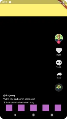
}Make sure you don’t miss the import line at the top. You should now be seeing something like this.
As you can see the share icon is a little larger than how it appears in the screenshot, and so is the Share text. We’ll add a boolean parameter called isShare to the getSocialAction function (default value false) and we’ll use that to make some custom adjustments. In your build function set isShare: true on the Share action. In the getSocialAction function we will return custom values for the following things by checking isShare.
Icon Size — size: isShare ? 25.0 : 35.0 , we want to set the size to 25 for the icon when it’s the share icon.
Text Top Padding — top: isShare ? 5.0 : 2.0, we want to return 5.0 padding between the text and the icon when it’s the share icon.
Title Font Size- fontSize: isShare? 10.0 : 12.0, we want to make the font size a bit smaller when it’s the share icon.
Those are the last changes to the SocialActions. See final code here.
Before we continue with the follow action lets get rid of the white background and make all the text white. Update the theme data in main.dart to apply white to the bodyColor and displayColor for the TextTheme, set backgroundColor on the home file’s scaffold and change the music note icon in the VideoDescription to white. And last but definitely not least. Remove color: Colors.red[300] from the actions_toolbar.dart
// main.dart text theme update
Widget build(BuildContext context) {
  return MaterialApp(
    title: 'Flutter Demo',
    theme: ThemeData(
      // Uncomment in phase 3 to apply white to text
      textTheme: Theme.of(context).textTheme.apply(
        bodyColor: Colors.white,
        displayColor: Colors.white
      ),
    ),
    home: HomePhase3(),
  );
}

// home.dart Scaffold update
Scaffold(
      backgroundColor: Colors.black,
      body: Column( ... ));

// video_description.dart Music note color update
Icon(Icons.music_note,  size: 15.0, color: Colors.white,),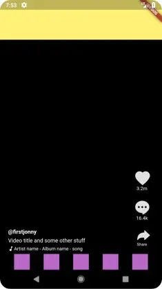
There we go, much better. Those theme updates makes us feel like we got a bit closer.
Follow Action
This piece of UI contains a round image with a “border” around it and a little plus button to indicate a follow action. The way we’ll build this is by breaking it into two parts, as shown below. The RoundImage with a “border” and the PlusIcon. I say “border” because we’ll use padding to achieve the look, not an actual border, which would be fine too.
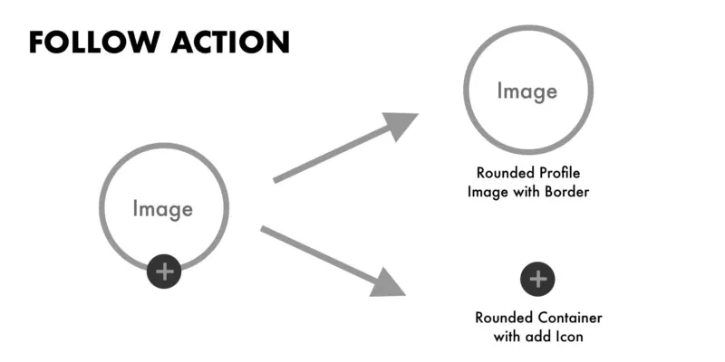
We will create a function called _getFollowAction which will return a Widget. At the root we’ll have a Container with the same dimensions as our SocialAction, 60.0. The child of this Container will be a stack where we will add our ProfilePicure first and then our PlusIcon Over that.
Widget _getFollowAction({
  String pictureUrl}) {
  return Container(
      margin: EdgeInsets.symmetric(vertical: 10.0),
      width: 60.0,
      height: 60.0,
      child: Stack( children: [
        _getProfilePicture(),
        _getPlusIcon()])
    );
}
Both of these elements will be inside Positioned widgets so we can control where they show up in the Stack widget. The Image will be in the middle horizontally. The plus Icon will be at the bottom of the container and in the middle horizontally. We’ll use the width of the action items and the child items to find the middle.The formula is simple
xMiddlePosition = (ParentWidth / 2) -(ChildWidth / 2);
But before we can do that easily, let’s move all our constant values into some constants so it’s easier to reference and adjust. Take all the constants values out and put them at the top of your actions_toolbar.dart file, like so:
// Full dimensions of an action
static const double ActionWidgetSize = 60.0;

// The size of the icon showen for Social Actions
static const double ActionIconSize = 35.0;

// The size of the share social icon
static const double ShareActionIconSize = 25.0;

// The size of the profile image in the follow Action
static const double ProfileImageSize = 50.0;

// The size of the plus icon under the profile image in follow action
static const double PlusIconSize = 20.0;
Now lets add the missing functions and import our image library CachedNetworkImage
import 'package:cached_network_image/cached_network_image.dart';

...
...

Widget _getPlusIcon() {
   return Positioned(
        bottom: 0,
        left: ((ActionWidgetSize / 2) - (PlusIconSize / 2)),
        child: Container(
          width: PlusIconSize,  // PlusIconSize = 20.0;
          height: PlusIconSize, // PlusIconSize = 20.0;
          decoration: BoxDecoration(
          color: Color.fromARGB(255, 255, 43, 84),
          borderRadius: BorderRadius.circular(15.0)
          ),
          child: Icon(Icons.add, color: Colors.white, size: 20.0, )),);
 }

 Widget _getProfilePicture() {
   return Positioned(
     left: (ActionWidgetSize / 2) - (ProfileImageSize / 2),
     child: Container(
        padding: EdgeInsets.all(1.0), // Add 1.0 point padding to create border
        height: ProfileImageSize, // ProfileImageSize = 50.0;
        width: ProfileImageSize, // ProfileImageSize = 50.0;
        decoration: BoxDecoration(
          color: Colors.white,
          borderRadius: BorderRadius.circular(ProfileImageSize / 2)
        ),
        // import 'package:cached_network_image/cached_network_image.dart'; at the top to use CachedNetworkImage
        child: CachedNetworkImage(
          imageUrl: "https://secure.gravatar.com/avatar/ef4a9338dca42372f15427cdb4595ef7",
          placeholder: (context, url) => new CircularProgressIndicator(),
          errorWidget: (context, url, error) => new Icon(Icons.error),
      ),
      ));
 }
We use the formula described before to set the left value of the items to the centre. We use containers with in both cases to size our children, the sizes are indicated next to the constant names with values in case you missed it. Lets go over what we just did here.
getProfilePicture: This a Container that is positioned in the middle of a 60x60 container. It has a borderRadius of half the main container’s width (to make it round), a white background and padding of 1.0 pixel to produce the outside border. The child of this container is a CachedNetworkImage with an imageUrl pointing towards my personal gravatar. It has a placeholder and an error widget for loading and incase something goes wrong.
getPlusIcon: A Container positioned to be in the middle of the parent with a border radius of half it’s width (to make it round), a background color (pink/red) and an “add” icon as the child.
Would you look at that. Just a one more step to go and our Toolbar is complete.
Music Action
This action is very similar to the FollowAction but to avoid overly complicated functions I’m just going to make a new one called _getMusicPlayerAction(). This will be a function that returns a Widget with the root widget being a Container with the same ActionWidgetSize (60.0). This time our Container will have a gradient background instead of a solid one and a padding of 11.0. Those are the only differences from the Inner UI code in the _getProfilePicture method. But we won’t use that now to keep things simple and avoid refactors at this point.
Add the below function into your actions_toolbar.dart file and add it as the last child in your main build function Column.
LinearGradient get musicGradient => LinearGradient(
        colors: [
          Colors.grey[800],
          Colors.grey[900],
          Colors.grey[900],
          Colors.grey[800]
        ],
        stops: [0.0,0.4, 0.6,1.0],
        begin: Alignment.bottomLeft,
        end: Alignment.topRight
      );

  Widget _getMusicPlayerAction() {
   return Container(
        margin: EdgeInsets.only(top: 10.0),
        width: ActionWidgetSize,
        height: ActionWidgetSize,
        child: Column(children: [
          Container(
            padding: EdgeInsets.all(11.0),
            height: ProfileImageSize,
            width: ProfileImageSize,
            decoration: BoxDecoration(
              gradient: musicGradient,
              borderRadius: BorderRadius.circular(ProfileImageSize / 2)
            ),
            child: CachedNetworkImage(
              imageUrl: "https://secure.gravatar.com/avatar/ef4a9338dca42372f15427cdb4595ef7",
              placeholder: (context, url) => new CircularProgressIndicator(),
              errorWidget: (context, url, error) => new Icon(Icons.error),
          ),
          ),

          ]));
  }
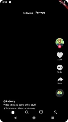
Aaaaaand, there we go! Doesn’t this look nice! now it’s just the Yellow block at the top left and the purple navigation icons.
Lets start by removing the top yellow block and putting out two text widgets there. Following and For You. We’ll wrap our text fields in a Row, then use the alignment property in the Container to push it to the bottom and then add some padding inside to make it fit our needs. Change your topSection property in home.dart to look like this.
Widget get topSection => Container(
          height: 100.0,
          padding: EdgeInsets.only(bottom: 15.0),
          alignment: Alignment(0.0, 1.0),
          child: Row(
              crossAxisAlignment: CrossAxisAlignment.end,
              mainAxisSize: MainAxisSize.min,
              children: <Widget>[
                Text('Following'),
                Container(
                  width: 15.0,
                ),
                Text('For you',
                    style: TextStyle(
                        fontSize: 17.0, fontWeight: FontWeight.bold))
              ]),
        );
Onto the Bottom bar we go.
Bottom Toolbar
The first step is easy, just add the icons from the TikTok icon pack I added in a row and that’s done. Make your bottom_toolbar.dart file look like below.\
import 'package:flutter/material.dart';
import 'package:tik_tok_ui/tik_tok_icons_icons.dart';

class BottomToolbar extends StatelessWidget {
  static const double NavigationIconSize = 20.0;

  @override
  Widget build(BuildContext context) {
    return Row(
      mainAxisAlignment: MainAxisAlignment.spaceEvenly,
      children: [
                Icon(TikTokIcons.home, color: Colors.white, size: NavigationIconSize),
                Icon(TikTokIcons.search,
                    color: Colors.white, size: NavigationIconSize),

                Icon(TikTokIcons.messages,
                    color: Colors.white, size: NavigationIconSize),
                Icon(TikTokIcons.profile,
                    color: Colors.white, size: NavigationIconSize)
              ],
    );
  }
}
All we did is replace the children: generate call with children: [] with 4 icons in it and voila! Look how nice that looks. Project manager and designer instantly happy. in under 20 minutes you can do all this in Flutter, amazing.
Next step is to produce our custom create button with the blue and red sides. We’ll do this in a property to keep our build method small. Lets see how we’ll break this down.
Whenever we overlay items on top of each other we need a stack. So we add a Stack as the root, a blue container on the left, a red container over that to the right and a our white container in the centre, they all have the same size, 38.0. We’ll make the parent container larger than 38.0 so you’ll see the edges of the left/right aligned boxes just a bit to give use the same effect.
Then the cherry on top is our Icon as the child of our centre (white) container. Add this property to your bottom_toolbar.dart file and use it in the build function in the middle of all 4 icons.
Widget get customCreateIcon => Container(
          width: 45.0,
          height: 27.0,
          child: Stack(
            children:[
              Container(
                margin: EdgeInsets.only(left: 10.0),
                width: CreateButtonWidth,
              decoration: BoxDecoration(
                color: Color.fromARGB(255, 250, 45, 108),
                borderRadius: BorderRadius.circular(7.0)
              )),

              Container(
                margin: EdgeInsets.only(right: 10.0),
                width: CreateButtonWidth,
              decoration: BoxDecoration(
                color: Color.fromARGB(255, 32, 211, 234),
                borderRadius: BorderRadius.circular(7.0)
              )),
              Center(child:Container(
                height: double.infinity,
                width: CreateButtonWidth,
              decoration: BoxDecoration(
                color: Colors.white,
                borderRadius: BorderRadius.circular(7.0)
              ),
              child: Icon(Icons.add, size: 20.0,),
              )),
              ]
          ));
AND. WE. ARE. DONE. Isn’t that a cool looking UI. Man I love making apps and building UI’s in Flutter.
Please give me a clap or two. Follow me for future Tutorials, I have a few planned an please share this with a fellow coder or Flutter beginner. I would very much appreciate that.
Thank you for reading. I hope this helped. Any feedback would be appreciated.