
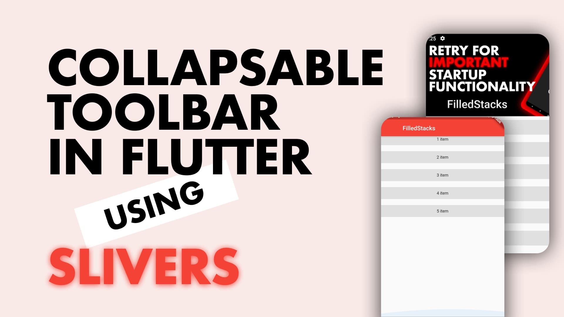
Expandable app bars are common in modern applications. Flutter makes this very easy to implement as well using the SliverAppBar. Let’s build the UI you see below in Flutter.
Implementation
We’ll start by supplying our MaterialApp with a theme with primary color red and an empty scaffold
class MyApp extends StatelessWidget {
@override
Widget build(BuildContext context) {
return MaterialApp(
theme: ThemeData(primaryColor: Colors.red),
home: Scaffold(
),
);
}
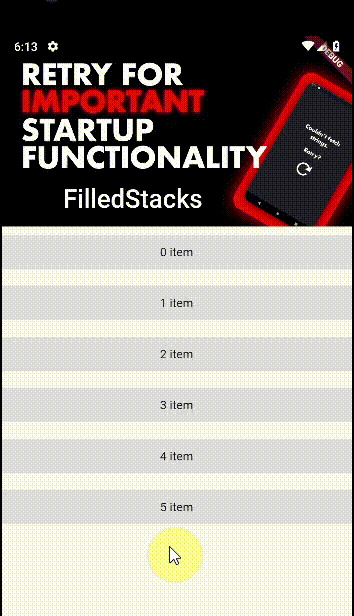
}To use Slivers in a Scrollable view we have to use the CustomScrollView widget. This allows us to use the Slivers to create custom scroll effects. We’ll set the body of your Scaffold to a CustomScrollView. We’ll also make the first child a SliverAppBar. Give it an expanded height of 200, floating to false, and we want the toolbar pinned to the top.
Widget build(BuildContext context) {
  return MaterialApp(
    theme: ThemeData(primaryColor: Colors.red),
    home: Scaffold(
      body: CustomScrollView(
        slivers: <Widget>[
          SliverAppBar(
            expandedHeight: 200,
            pinned: true,
            flexibleSpace: FlexibleSpaceBar(
              title: Text('FilledStacks'),
              background: Image.asset(
                '022.jpg', // <===   Add your own image to assets or use a .network image instead.
                fit: BoxFit.cover,
              ),
            ),
          ),

        ],
      ),
    ),
  );
}
Pinned true tells the the CustomScrollView to keep the AppBarVisible even when collapsed and not scroll it out of view. You can set it to false if you want it to scroll out of view when completely collapsed. You can also use floating to make it appear when it’s out of view and you scroll down. To see the scrolling in action lets fill the rest of the space up. We have a SliverFillRemaining widget that takes single child that will take up the rest of the space in the CustomScrollView.
We’ll use the SliverFillRemaining widget to add the rest of the UI so we can see it scrolling. Add this as the second sliver, in the CustomScrollView under the SliverAppBar.
 SliverFillRemaining(
  child: Column(
    children: List<int>.generate(6, (index) => index)
        .map((index) => Container(
              height: 40,
              margin: EdgeInsets.symmetric(vertical: 10),
              color: Colors.grey[300],
              alignment: Alignment.center,
              child: Text('$index item'),
            ))
        .toList(),
  ),
)
It’s that simple. Now you can use this in your designs to easily create parallax / collapsing headers. Check out some of the other snippets as well.