
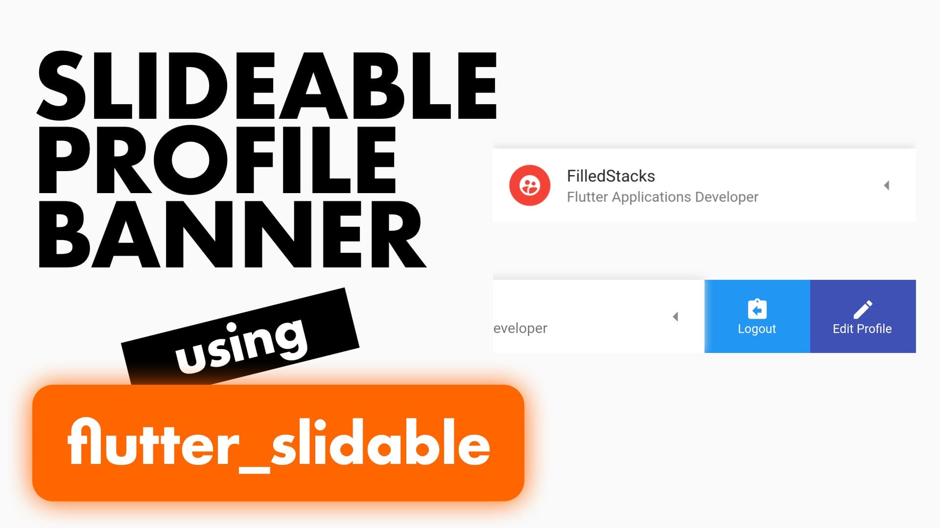
In this tutorial we will build a user profile banner that you can slide for more user options. This can be added into your Drawer where you usually have your user profile banner. Additionally you can keep this on some screens for quick access to the user options. This can also be used for something like a shopping cart where you display your total and number of items and allow them to edit or checkout directly from the swipe actions on this banner. Or for it’s intended purpose which is list items with swipe options.
Setup
We’ll use the flutter_slidable package to implement our sliding banner so add it as a dependency to your project.
flutter_slidable: ^0.5.3To keep the tutorial to the point we’ll clean up the main file and develop in the body of the scaffold. Make your MyApp class file look like this.
class MyApp extends StatelessWidget {
  @override
  Widget build(BuildContext context) {
    return MaterialApp(
        title: 'Slide Tile',
        home: Scaffold(
          body: Align(
            alignment: Alignment.bottomCenter,
             child: ProfileBanner()
          ),
        ),
    );
  }
}
Then we’ll create a new stateless widget for the ProfileBanner.
class ProfileBanner extends StatelessWidget {
  @override
  Widget build(BuildContext context) {
    return Container();
  }
}
Implementation
The profile banner will contain a Slidable widget from the package that will give us the sliding functionality. This widget takes in an actionPane that changes the way the items are revealed, you can choose between the following styles:
- SlidableDrawerActionPane: Slides out the actions in a parallax effect as the item slides open
- SlidableScrollActionPane: Slides out the actions in sync with the banner creating a fixed row effect
- SlidableBehindActionPane: Actions stay fixed in the back while the banner slides over it to reveal it
It also takes a child widget which will be the banner that you slide away, we’ll use a container with the child being a ListItem to make use of it’s existing layout. For the actions you can supply either the actions (left side) or the secondaryOptions (right side). Let’s build the UI. We’ll start by returning the Slidable widget from the build function with the actionsPane SlidableDrawerActionPane and a container as it’s child.
Widget build(BuildContext context) {
return Slidable(
actionPane: SlidableDrawerActionPane(),
child: Container(
decoration: BoxDecoration(color: Colors.white, boxShadow: [
BoxShadow(
color: Colors.grey[300], blurRadius: 6, offset: Offset(0, -2))
]),
child: ListTile(
leading: CircleAvatar(
backgroundColor: Colors.red,
child: Icon(
Icons.supervised_user_circle,
color: Colors.white,
),
),
trailing: Icon(Icons.arrow_left),
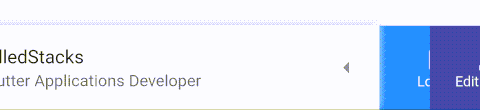
title: Text('FilledStacks'),
subtitle: Text('Flutter Applications Developer'),
),
),
);
}This will give you the banner that we’ll be sliding out. There will be no slide functionality yet because we haven’t defined any actions yet. We’ll use the secondaryActions to add our actions on the right side.
Widget build(BuildContext context) {
    return Slidable(
      ...
      child: Container(...),
      secondaryActions: <Widget>[
        IconSlideAction(
          caption: 'Logout',
          color: Colors.blue,
          icon: Icons.assignment_return,
          onTap: () {},
        ),
        IconSlideAction(
          caption: 'Edit Profile',
          color: Colors.indigo,
          icon: Icons.edit,
          onTap: () {},
        ),
      ],
    );
}
Add the actions under the child and that’s it. If check out the UI now you’ll see a banner at the bottom of the screen that you can slide to the left for additional options. Check out some of the other Snippets on the website for more Flutter tutorials.