
In this tutorial we’ll cover how to show in app notifications in your Flutter application. We’ll start off by adding the overlay_support package
overlay_support: ^1.0.0To use the Overlay functionality we have to wrap our Material app in the OverlaySupport widget.
class MyApp extends StatelessWidget {
  @override
  Widget build(BuildContext context) {
    return OverlaySupport(
      child: MaterialApp(
          title: 'Flutter Demo',
          home: Scaffold(),
      ),
    );
  }
}
We’ll show modifications for the notification overlay. The library can do a little bit more with toasts as well that you can get into. We’ll cover:
- Basic notification that auto dismisses
- Fixed notification with button to dismiss
- Message style custom notification
We’ll write all the code in the onPressed callback in the FloatingActionButton of the scaffold so set that up as well.
Widget build(BuildContext context) {
return OverlaySupport(
..
home: Scaffold(
floatingActionButton: FloatingActionButton(
onPressed: () {
// notification code will go here
},
)
),
);
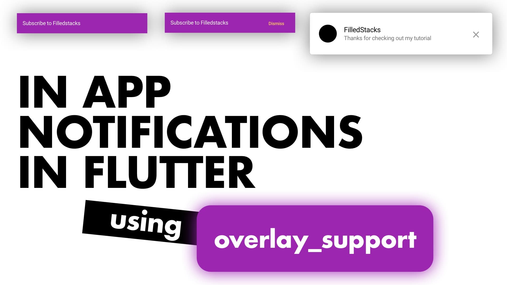
}Basic notification
We’ll start off with the basic notification. A purple notification with some text
  showSimpleNotification(
    Text("Subscribe to FilledStacks"),
    background: Colors.purple,
  );
Fixed notification with Dismiss button
To make a notification stay without auto dismissing we set autoDismiss to false. We don’t want the notification to stay there all the time so we’ll build a trailing button that the user can tap to dismiss.
  showSimpleNotification(
    Text("Subscribe to FilledStacks"),
    background: Colors.purple,
    autoDismiss: false,
    trailing: Builder(builder: (context) {
      return FlatButton(
          textColor: Colors.yellow,
          onPressed: () {
            OverlaySupportEntry.of(context).dismiss();
          },
          child: Text('Dismiss'));
    }),
  );
Custom Notification
To show some custom UI you can use the showOverlayNotification function. It takes a builder as the first positional argument. We’ll return a Card with some side margins, the contents of the card we’ll wrap in a SafeArea since it’ll be displaying at the top of the screen where notches can interfere. The content of the notification will be a basic ListTile with all the properties set.
showOverlayNotification((context) {
    return Card(
      margin: const EdgeInsets.symmetric(horizontal: 4),
      child: SafeArea(
        child: ListTile(
          leading: SizedBox.fromSize(
              size: const Size(40, 40),
              child: ClipOval(
                  child: Container(
                color: Colors.black,
              ))),
          title: Text('FilledStacks'),
          subtitle: Text('Thanks for checking out my tutorial'),
          trailing: IconButton(
              icon: Icon(Icons.close),
              onPressed: () {
                OverlaySupportEntry.of(context).dismiss();
              }),
        ),
      ),
    );
  }, duration: Duration(milliseconds: 4000));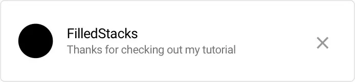
You can build a notification widget that you can pass in the title and message if you have multiple messages to show. Check out the other snippets on the site for more Flutter tutorials.