
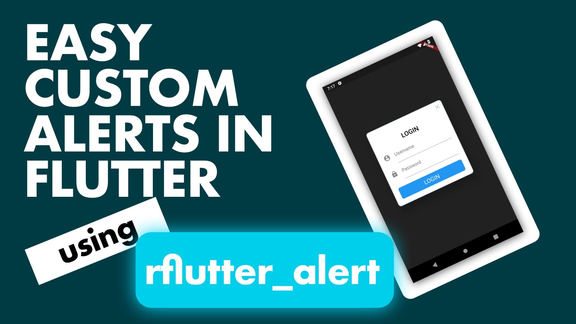
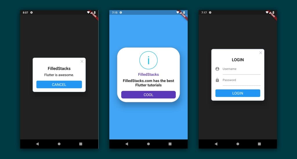
In this tutorial we’ll use RfFlutter to show dialogs like below.
We’ll go from left to right. First thing to do is add the package
rflutter_alert: ^1.0.2Basic Alert
RfFlutter has a decent looking basic alert and can be easily used. We’ll setup a basic app with a HomeView stateless widget. I’m going to use functional widget so that I don’t write too much code. You can use normal stateless widgets by defining the entire class. We’ll have our app with a simple HomeView widget. We’ll have one button in the center that we’ll use throughout the entire tutorial.
class MyApp extends StatelessWidget {
  @override
  Widget build(BuildContext context) {
    return MaterialApp(home: HomeView('Home view Title'));
  }
}

@widget
Widget homeView(BuildContext context, String title) => Scaffold(
    body: Center(
        child: MaterialButton(
  color: Colors.yellow,
  child: Text('Show Alert'),
  onPressed: () {
    // Show a basic widget
    Alert(context: context, title: "FilledStacks", desc: "Flutter is awesome.")
        .show();
  },
)));
The code in the onPressed function call is all we need to show a basic widget.
Custom widget styling
The base widget can be styled and has the following properties.
  final AnimationType animationType;
  final Duration animationDuration;
  final ShapeBorder alertBorder;
  final bool isCloseButton;
  final bool isOverlayTapDismiss;
  final Color overlayColor;
  final TextStyle titleStyle;
  final TextStyle descStyle;
  final EdgeInsets buttonAreaPadding;
based on that you can make a very rounded alert, that doesn’t dismiss when you tap outside of it. And has a blue overlay to indicated an info notice.
 var alertStyle = AlertStyle(
          overlayColor: Colors.blue[400],
          animationType: AnimationType.fromTop,
          isCloseButton: false,
          isOverlayTapDismiss: false,
          descStyle: TextStyle(fontWeight: FontWeight.bold),
          animationDuration: Duration(milliseconds: 400),
          alertBorder: RoundedRectangleBorder(
            borderRadius: BorderRadius.circular(50.0),
            side: BorderSide(
              color: Colors.grey,
            ),
          ),
          titleStyle: TextStyle(
            color: Color.fromRGBO(91, 55, 185, 1.0),
          ),
        );

        Alert(
          context: context,
          style: alertStyle,
          type: AlertType.info,
          title: "FilledStacks",
          desc: "FilledStacks.com has the best Flutter tutorials",
          buttons: [
            DialogButton(
              child: Text(
                "COOL",
                style: TextStyle(color: Colors.white, fontSize: 20),
              ),
              onPressed: () => Navigator.pop(context),
              color: Color.fromRGBO(91, 55, 185, 1.0),
              radius: BorderRadius.circular(10.0),
            ),
          ],
        ).show();
Custom content
It’s not only the styling that you can change but you can also add your own content. Let’s add an alert popup that would show when you want the user to login again.
   Alert(
        context: context,
        title: "LOGIN",
        content: Column(
          children: <Widget>[
            TextField(
              decoration: InputDecoration(
                icon: Icon(Icons.account_circle),
                labelText: 'Username',
              ),
            ),
            TextField(
              obscureText: true,
              decoration: InputDecoration(
                icon: Icon(Icons.lock),
                labelText: 'Password',
              ),
            ),
          ],
        ),
        buttons: [
          DialogButton(
            onPressed: () => Navigator.pop(context),
            child: Text(
              "LOGIN",
              style: TextStyle(color: Colors.white, fontSize: 20),
            ),
          )
        ]).show();
Some organisation
If you’re going to use alerts in multiple places and you want different styles I’d recommend creating a dialog helper file where you can store all your styles and predefined widgets.
// dialog_helper.dart


showLoginDialog(
  BuildContext context, {
  TextEditingController usernameController,
  TextEditingController loginController,
  Function onLoginPressed
}) {
  Alert(
      context: context,
      title: "LOGIN",
      content: Column(
        children: <Widget>[
          TextField(
            decoration: InputDecoration(
              icon: Icon(Icons.account_circle),
              labelText: 'Username',
            ),
          ),
          TextField(
            obscureText: true,
            decoration: InputDecoration(
              icon: Icon(Icons.lock),
              labelText: 'Password',
            ),
          ),
        ],
      ),
      buttons: [
        DialogButton(
          onPressed: onLoginPressed,
          child: Text(
            "LOGIN",
            style: TextStyle(color: Colors.white, fontSize: 20),
          ),
        )
      ]).show();
}
Now in your code all you’ll have to do is
@widget
Widget homeView(BuildContext context, String title) => Scaffold(
        body: Center(
            child: MaterialButton(
      color: Colors.yellow,
      child: Text('Show Alert'),
      onPressed: () {
        showLoginWidget(context,
        onLoginPressed: (){  /* Do stuff */ }); // <-- Much better readability
      },
    )));
When you have many alert styles store them as const in the helper file and reuse them. And that’s it. Thanks for reading.
Checkout all the other snippets here. You might find some more Flutter magic.